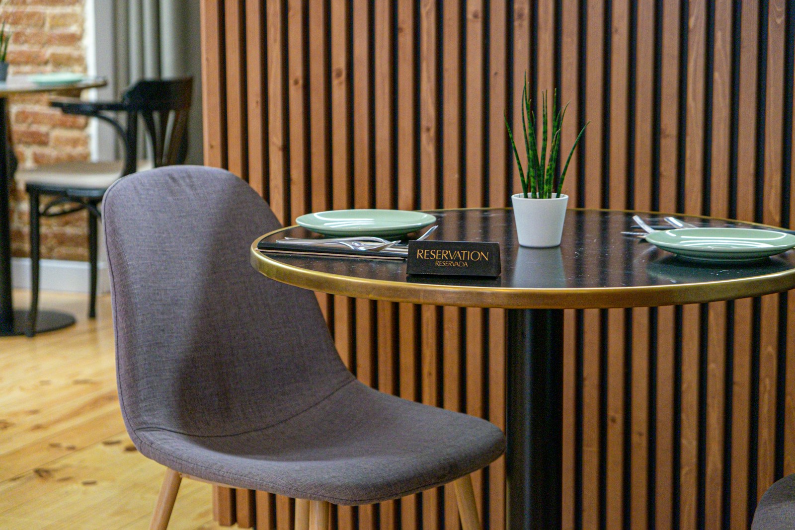
Examples of hotel-apartment websites
Why your apartment-hotel website should be eye-catching
In this article, we take a closer look at several examples of hotel-apartment sites to understand why. Average stays are getting longer (4.8 nights in 2024, +11 % in one year according to STR); customers want autonomy, while demanding the fluidity of a hotel check-in. As a result, first impressions are no longer made in the lobby, but on a 6.8-inch screen, often between two metro stops. In other words website becomes your lobby - with 24-hour receptionist, concierge and sales desk included.
Many freelancers are still cobbling together a generic template, but they're missing the point: by , 70 % of travellers expect an experience mobile-first and at least 40 % more conversion when the route is personalised mediaboom.com. That's why we're going to take a look at a few sites that (really) do the job, track down freshly baked design trends and compile some ready-to-code best practices. And that's exactly what we'll be doing in these examples of hotel-apartment websites analysed below.
Five inspiring examples of apartment-hotel websites below!
![]()
Hotel Web Design is the web agency 100% dedicated to the hotel industryWe can help you with all aspects of digital communication for your accommodation: booking websites, natural referencing specialising in the hotel industry, Google Ads referencing and Google Hotel Ads, social networking campaigns, graphic charters and logos for hotels.
Make an appointment today for free advice on how to optimise the digital management of your accommodation.
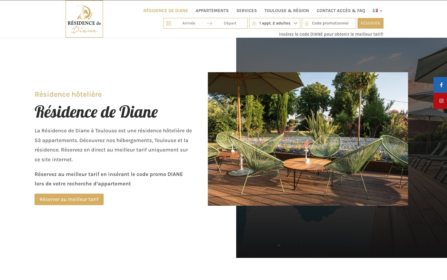
Résidence de Diane - full-page elegance
- Home page Full-screen photo of a quiet garden with swimming pool, immediately illustrating the comfort and serenity of the residence.
- Slogan The message is: "The independence of a flat, the services of a hotel". A reassuring message that sums up the hybrid offer in one sentence.
- Tip that changes everything The booking button is clearly visible at the top of the page and leads to a fluid integrated engine. No redirection to a third-party site: the experience remains fluid and professional.
Why is this relevant? Because on mobile as on desktop, every second counts. The Résidence de Diane avoids technical friction and enhances its setting from the very first seconds, reassuring and engaging visitors.
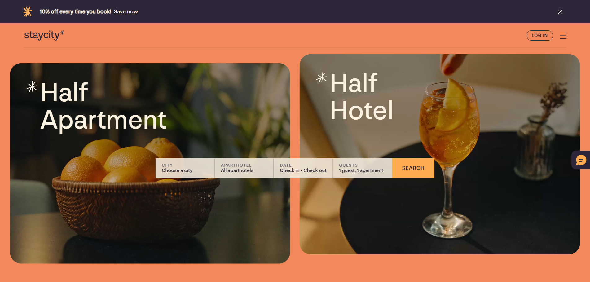
Staycity - pragmatism made simple
- Home page Full-screen shot of a bright studio, punctuated by an eye-catching yellow mug.
- Slogan Half apartment, half hotel". Six words, clear message, no overload.
- Tip that changes everything The "Book" button remains discreet but is always visible in the fixed header. When you click it, you don't leave the site: the home page is the first stage of the engine. No extra loading time, so no friction.
Why is this relevant? Because a web user who has to wait for or reload a date form is 40 % more likely to give up. Staycity understands this: speed and legibility come first.
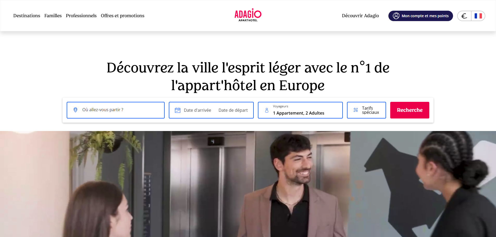
Adagio - the power of the network, plus consistency
Adagio, a brand of the Accor group, manages over 100 establishments. Its website focuses on :
- A multi-destination engine with clear filters: budget, premium, long stay.
- Standardised photos The same framing, the same grid, the same size. Users can instantly spot key information without having to decode a different template for each city.
- Member benefits The price is displayed at first glance: "-10 % for ALL members". The price argument is clear, transparent and attractive.
Why is it useful for a self-employed person? A single site can host several residences if the visual charter is strict. A good template, repeated, saves time and reassures the user.
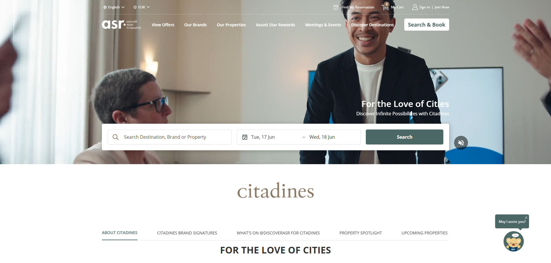
Citadines - metasearch connection under control
Citadines is not trying to impress with its avant-garde design. Its trump card: native integration with comparators (Google Hotel Ads, Trivago, Kayak).
- Prices and availability are updated in real time via an API linked to the Ascott engine.
- Lower acquisition costs Cendyn calculates a fall of 23 % on the marketing budget thanks to this direct gateway.
Lessons to be learned Your site is not just for direct visitors. It "feeds" the comparators, which then send back very hot future customers. A clean connection to metasearch avoids price discrepancies and builds trust.
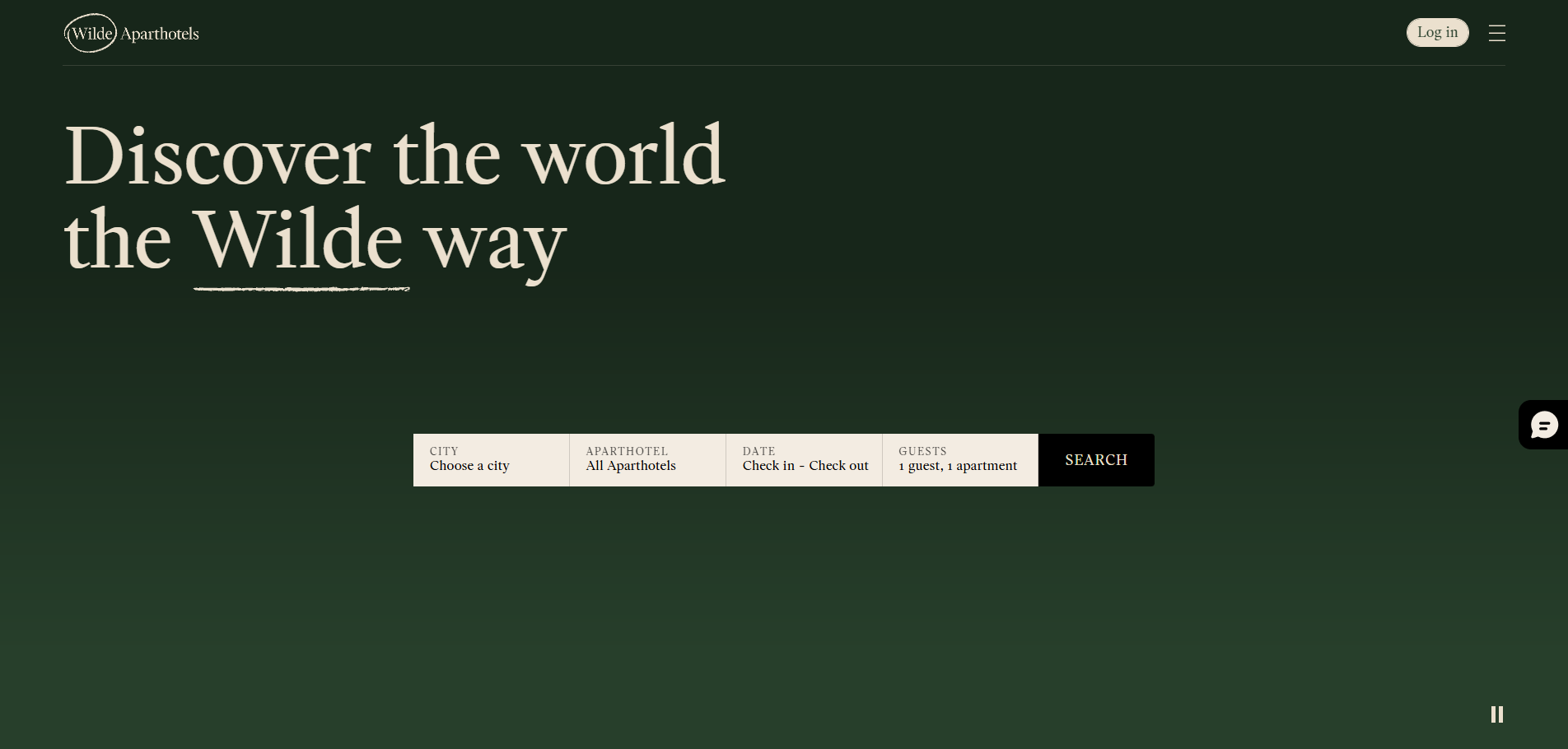
Wilde Aparthotels - emotion at the service of the brand
Staycity's top-of-the-range cousin, Wilde opts for emotion:
- Art Deco typographya nod to Oscar Wilde.
- Gentle micro-animations scrolling: drop shadow, icon hovering.
- Bold editorial copy Sleep like an Irish poet, wake up facing the Thames".
Everything else - booking engine, page structure - is shared by the group. Proof that it's possible to share techniques and personalise the atmosphere.
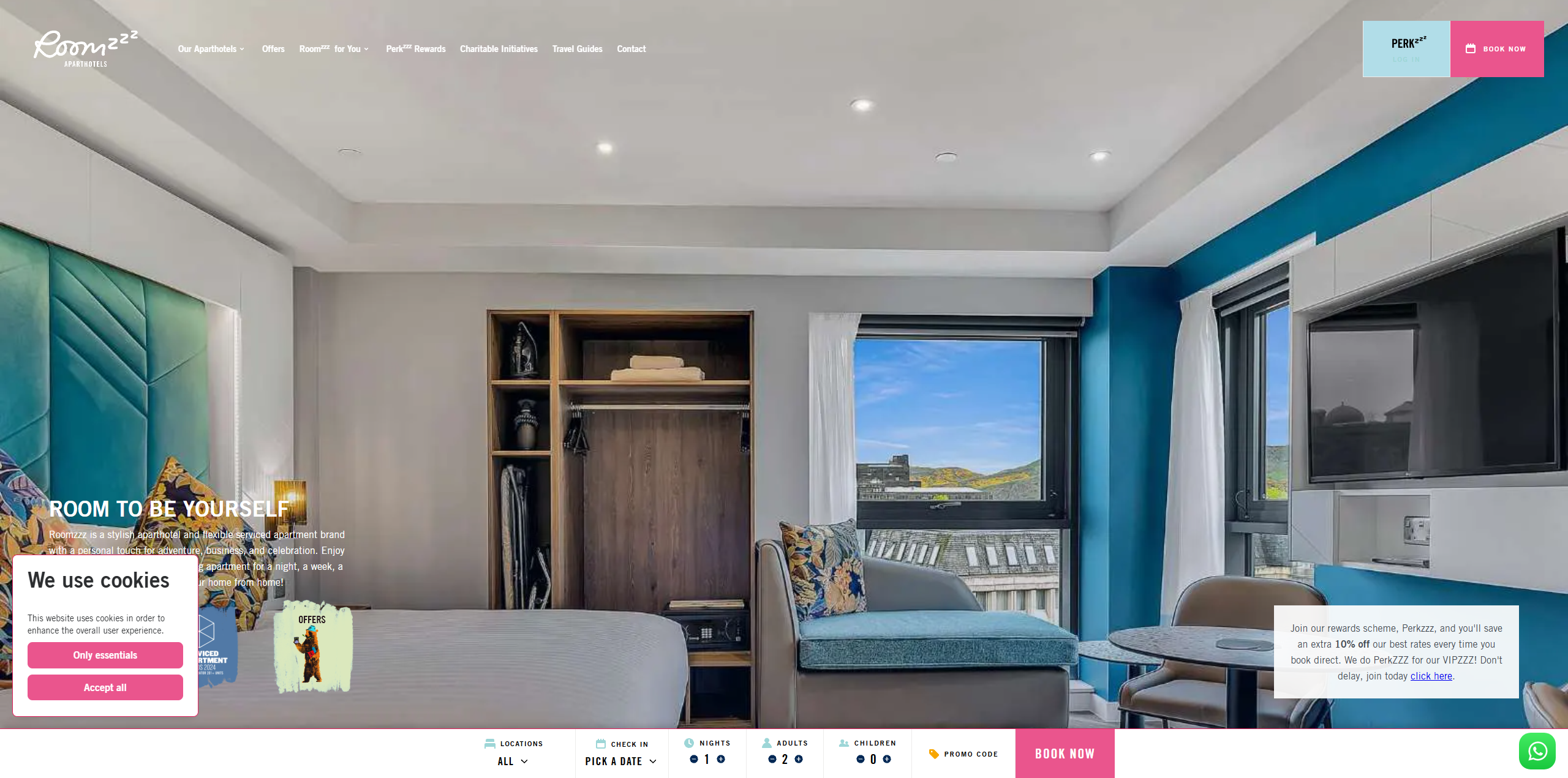
Roomzzz - a focus on local life
This UK-based network has understood the importance of the neighbourhood:
- Interactive maps which combine points of interest (parks, supermarkets) with walking times.
- My City Like a Local blog supplied by the teams at each residence.
- I'm travelling with my dog" filter directly into the engine, avoiding the need to call or email to check the animal policy.
Why is it clever? Long stays are often synonymous with local life: guests want to know where the bus stop, supermarket or gym is. Roomzzz answers before you ask.
Design trends for a hotel-apartment website
| Trend | What it means | How to apply it |
|---|---|---|
| Mobile first, barrier-free | More than half of all bookings come from a smartphone. | Large, easy-to-touch buttons, condensed menu, vertical drop-down form. |
| Short 8-second video | A silent video in the background replaces the old slideshow. | Lightweight MP4 loop (< 3 MB) with accessible pause button. |
| Green content | Customers can compare the carbon footprint of their stay. | Certified green badge, clear "Our commitments" page, up-to-date figures. |
| Voice booking on the rise | Reservations can be made via Alexa or Google Home. | Integrating a signposted FAQ schema.org for voice search. |
| Immersive 360° photos | A reassuring virtual tour for a long stay. | A single 360° photo for each type of home is enough to convince. |
Sources: LinkedIn Up Hotel Agency linkedin.com ; Syspree Blog syspree.com.
Essential features of a hotel apartment website
Integrated booking engine (not external)
Your URL must remain the same throughout. A pop-up or iframe from a third party breaks trust. Ideally, the search engine should display a clear calendar: available dates in green, closed dates in pale red.
Instant availability calendar
No more "We'll get back to you" requests by e-mail. The user ticks, sees, pays - and receives confirmation in less than 30 seconds.
Multi-currency and multi-language rates
The browser already indicates the user's language. Your site should adapt automatically, or offer a visible selector in the top right-hand corner. The same goes for the currency: displaying the price in euros to an American who thinks in dollars means risking confusion.
Secure payment, mobile wallet compatible
Apple Pay, Google Wallet: in London, more than a quarter of mobile bookings are made using one-tap payment. Offer them.
Natural, non-intrusive upsell
Parking, breakfast, extra cleaning: add these options to the second screen from the booking tunnel, never by e-mail three days later.
Mobile check-in and digital door opening
Long-stay guests don't like waiting. Customers generate their digital key from their customer area or a secure link, five minutes before arrival.
Local and long-term SEO
Optimise for queries such as "appart hôtel Marseille parking longue durée". Use tagging schema.org/Hotel to help Google understand your services and display your prices in the results.
Good practice confirmed by the figures
Strategic advice for your future site
6.1 Talk like a human
Replace "hotel units" with "ready-to-live-in studios". Avoid legal paragraphs in the first line. Clear language creates proximity.
6.2 Use your dormant data
If 40 % of visitors click on "Parking" and then leave when it's full, automatically offer them a partner car park in the area. Your internal statistics are a goldmine.
6.3 Highlight your long-stay advantages
Office, supermarket, launderette: place this information in the first third of the page. Long-term travellers look for practicality before decoration.
6.4 Add a touch of emotion
A steaming cup of coffee, the sound of the waves in the background - these micro-details are enough to break the cold image that an apartment-hotel can convey.
6.5 Test, measure, prioritise
A site is never "finished". Go live, measure clicks, adjust. Concentrate on what improves the net income per flat (Net RevPAR), not on a pointless animation that earns nothing.

Simplified technical roadmap
CMS : WordPress or Strapi - easy to translate and packed with hotel plugins.
Front-end : Next.js coupled with Tailwind - ensures lightning-fast loading and a consistent design from one screen to the next.
Progressive Web App : Workbox - automatically adds an 'app' icon on the smartphone and offers offline consultation.
Booking engine : Mews or Cloudbeds - manage multiple currencies and recover abandoned baskets.
Analysis: Google Analytics 4 and Hotjar - a duo that combines figures and heat maps to understand the customer journey.
Metasearch connector : Triptease or Cendyn - your tariffs remain synchronised everywhere without double entry.
Note: there's no need to remember every acronym. The idea is to use tried and tested tools, not to reinvent the wheel.
Conclusion: the winning recipe in three verbs
Creating a hotel apartment website is no longer about lining up three photos and a red button. It's about orchestrating a mobile, fast, personalised and friendly. The examples studied - Staycity the pragmatic, Adagio the structured, Citadines the techno-connected, Wilde the emotional, Roomzzz the local, SACO/Locke the modular - show that there is no single path to success.
Keep this list of three verbs close to your keyboard:
- Simplify to convert.
- Customise to build loyalty.
- Humanise to make an impression.
With these principles, your site will become a real generator of direct bookings - and not just an online business card.


