Grid site design - Set a number of columns, constant gutters and a hierarchy of sections right from the wireframe, and you'll save days of production time while improving legibility, performance and conversion. The aim is not to obtain a pixel-perfect page, but to put in place a repeatable structure: a system. Here's how to organise sections and columns so that the content breathes, the navigation seems obvious and the responsive aspect remains manageable without CSS overload.
Order sections before columns
Start by laying out your key sections, from top to bottom. Each section has a unique role: proof, promise, catalogue, decision support, reassurance, contact. If you try to adjust the number of columns without clarifying the intention of each block, you'll bloat the CSS and the content will look patchwork.
The simple rule: one section = one intention = one template. The opening hero is often full-width, the product section unfolds in a grid, the editorial zone adopts a central column with a narrow line width (60-75 characters), and the conversion zone requires asymmetrical columns to anchor a form next to arguments.
Vertical rhythm, breathing and base lines
Vertical rhythm evens out the spacing between headings, paragraphs, maps and images, so that the eye anticipates what's coming next. Define a spacing scale (for example 4, 8, 12, 16, 24, 32, 48 px...) and stick to it. The line-height of paragraphs is aligned with this typographic grid, and the vertical margins of components are aligned with it. The result: a page that falls into place whatever the density of the content. This discipline also makes responsive easier: your spacing values are resampled cleanly, with no unexpected collisions between blocks.

Choosing the right column grid
12 columns is still an excellent compromise: divisible by 2, 3, 4 and 6, it covers most patterns (1/2, 1/3-2/3, 1/4...). If you are planning very dense interfaces (dashboards, tables, maps), go to 16 or 24 columns, but impose locks (e.g. multiply only by 2 or 3) to avoid explosive combinatorics.
Don't confuse container and grid. The container sets the maximum width of the content (e.g. 1200-1440 px) and is centred. The grid extends across the entire width of the container and governs the internal columns. Keep identical gutters from one breakpoint to the next whenever possible, or use a scale linked to the viewport (clamp) to keep comfortable side margins on large screens without diluting the content.
If you are starting with a framework, clearly document the system you have adopted. For a pragmatic overview, explore grids in web designThe article illustrates the choice of columns, gutters and containers in popular frameworks and helps you select a base compatible with your needs.
Use cases: editorial, catalogue, lead-gen
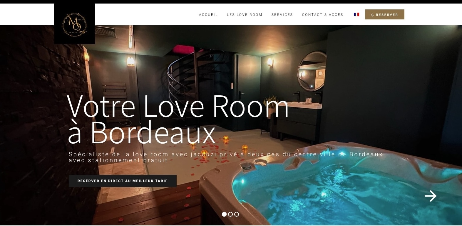
A blog favours a central column for the text, and card grids (2 to 4 columns) for the index. A product catalogue takes advantage of a malleable grid (2 → 4 → 6 columns depending on the viewport) and a filtering sidebar that accordions on mobile. An acquisition page combines full-width sections (credibility) and a pressed column (form or action button). For a tourist establishment, for example a landing dedicated to promoting a residence, structure the header with a text + visual column and a second section with benefit grids, as illustrated by this approach from promotion of a hotel residence.
Your quote in 5 minutes
Responsiveness: breakpoints that really serve the content
Your breakpoints should flow from the content, not from dogma. Test the reflow: enlarge/reduce the window and note the points where lines become too long, where a card falls wrong, where a column needs rebalancing. These points become your thresholds. In mobile-first, start with a single column, then expand to 2, 3 or 4 columns where width allows, respecting a maximum line width for legible text.
For an educational overview of patterns and methods, read how to use grids in web designThe article covers concrete cases and shows how columns are recomposed at different thresholds.
Gutters, margins and density
On mobile devices, gutters that are too thin stick components to the edges and tire the thumb. On the desktop, gutters that are too wide dilute the hierarchy. Use a clamp function to adjust the gutter between a minimum and a maximum. For example, clamp(12px, 2.2vw, 24px) keeps tactile comfort at the bottom and reasonable density at the top.
Beware also of stacking: on mobile, a block with an image, title, description, CTA, tags, price... must remain scannable. Prioritise the elements, cut lines to 2 or 3, and leave spaces to breathe. The grid doesn't solve everything: editing the content is a step in its own right.
CSS Grid and Flexbox: complementary roles
Use CSS Grid for the architecture of pages and complex sections (zones, templates, two-dimensional alignments), and Flexbox for the layout of items along an axis (buttons, menus, carousels). Grid reduces the need for unnecessary wrappers, enables precise alignment and simplifies reorganisation within the same template according to breakpoint. For a clear overview, start with The basic concepts of CSS grids - MDN Web Docs, Then experiment with minimal mock-ups before generalising.
Named zones, minmax(), auto-fit/auto-fill
Named zones make the grid readable and reorganisable: an aside can pass under the content on a mobile device without duplicating any code. The minmax() function prevents stuck cards by setting useful minima (e.g. minmax(240px, 1fr)). With auto-fit/auto-fill, you let the browser fill the available columns, which is perfect for galleries or modular card lists.

Text, measurements and typography in a grid
The ideal size for a paragraph is around 60-75 characters; beyond that, reading fatigue increases. Limit your text columns to a maximum width and manage intrusive images by flowing them above/below on mobile. Headings should occupy the grid without creating uncomfortable scales: avoid headings that spread out over all the columns if the content does not follow behind, otherwise the hierarchy will be misleading.
Adopt a relative typographic scale (rem, clamp) and define a typographic container that limits the width of paragraphs independently of the surrounding card grid. This protects legibility when the design becomes denser.
Accessibility: order, reference points and consistency
The grid must never break the logical reading order. Think source order: visually rearranged zones must remain consistent for screen readers and keyboard focus. Add ARIA markers for the sections (banner, navigation, main, complementary, contentinfo) and a Go to content bypass link. .
Plan for contrast, the minimum size of tactile targets, visible :focus states and compliance with reduced motion. Interactive elements located in narrow columns must remain reachable and not jump out from under the finger when the grid is recomposed.
Performance and technical debt
A grid that is too abstract or too magical will cost you in debugging. Limit DOM depth (avoid wrappers to align wrappers, etc.), prefer Grid to hacks based on negative margins, and document the rules: number of columns per breakpoint, gutters, vertical spaces, image behaviour, truncation rules.
Watch the cascade: if your layout utilities proliferate, you'll lose the intent. Go for tokens (spacings, sizes, colours) and a few semantic classes (section, cluster, sidebar, rail) rather than dozens of cryptic variants. Aim for convergence: same spacing, same rounding, same shadows, same image ratios throughout the interface.
CMS integration and content blocks
In a CMS with blocks, define self-supporting templates: card grid (fixed image ratio, 3 card sizes), editorial section (controlled central column), proof banner (logos in a fluid grid), comparison area (table or 1/3-2/3 cards depending on viewport). Each template comes with its own constraints to avoid surprises when editors enter the content.
Your quote in 5 minutes
The blog is an excellent school for grid discipline: a clear index, article details with coherent images, an opportunistic but non-intrusive sidebar. To work on the editorial value as much as the layout, see what to put in a blog, then structure your templates to accommodate these formats without breaking the reading experience.
Conversion: visual hierarchy, side rails and CTA
The role of the grid on the conversion side is to orchestrate attention. On the desktop, a side rail can accommodate the persistent CTA, while the main content unfolds the benefits. On mobile, the CTA takes its place above the long sections, or as a sticky bar at the bottom of the screen, but without masking the essential interface elements.
Editorial pages can also convert if the structure is clear: scannable headings, relevant visuals, evidence boxes distributed throughout the flow, and a contextual call to action. For content acquisition strategies, see how to boost bookings with a blog with a layout that guides you towards making contact.
When the reader is ready, reduce friction: place an explicit and accessible CTA. If you want to frame a project, book a slot via Your quote in 5 minutes and align your needs in terms of structure, content and accessibility.
Cross-functional components and micro layouts
The grid is not just used for large sections: it also governs micro layouts. A comment with avatar, a price insert, an FAQ block or a chat module should be aligned with implicit columns to avoid visual cacophony. Conversational assistants, for example, benefit from being harmoniously integrated into the overall rhythm of the layout: non-obtrusive opening, legible flow, discreet transitions. To find out more about the impact of these tools on the customer experience, explore chatbots and virtual assistants and think about their position in the grid so that they help without distracting.

Method: from wireframe to design system
1) List the pages and their purpose. 2) Draw up a list of typical sections and states (empty, long, error, loading). 3) Choose columns and gutters by breakpoint. 4) Build low-fidelity wireframes with Grid/Flex. 5) Define tokens (spaces, colours, typefaces) and image rules. 6) Document the templates on a live style page. 7) Test on real content: long paragraphs, short/long titles, oversized images, translated elements. 8) Iterate on density and readability. 9) Extend coverage to edge-case modules (tables, multi-step forms).
This method limits discrepancies. Developers read the docs, editors rely on the templates, and products evolve without tearing up the grid every time a new section is added.
Common mistakes and remedies
- Too many breakpoints: focus on 2-3 useful content-based thresholds. - Inconsistent gutters: set a scale and stick to it. - Variable image ratios: impose one or two ratios, frame and crop cleanly. - Unreasonably wide text: limit the reading width. - Alignments broken by exceptions: encapsulate special cases in dedicated templates. - Rigid grid: use minmax(), auto-fit and named zones to retain flexibility. - Inconsistent source order: repair accessibility before visual polish.
Example of section/column orchestration
Let's assume a product page: 1) Full-width hero: title, subtitle, visual, CTA. 2) Evidence: customer logos in fluid grid with auto-fit. 3) Features: 2-column grid on mobile → 3/4 columns on desktop; each card has a title, a short paragraph, a pictogram. 4) Comparison: 1/3-2/3 grid, the main table takes up the space; on mobile, we stack and offer a horizontal nav for the columns. 5) Testimonials: optional side rail on desktop, simple carousel on mobile. 6) FAQ: accordions with controlled text width. 7) Final CTA: airy section, repeats promise with embedded form.
Each defined section comes with its own set of columns. The important thing is to avoid breaking the vertical rhythm: the same spacing between blocks, headings that form a regular skyline, and gradual transitions in density.
For those involved in tourism and hospitality
Interfaces need to support both inspiration (large, immersive photos) and decision-making (clear information sheets, filters, comparisons, testimonials). A successful structure combines large visual sections with compact information grids. Adapt the columns to the editorial seasonality: in periods of high demand, highlight promotions in a rail; out of season, switch to an editorial story. To refine your messages and priorities, you can take inspiration from the following approaches optimising online communication for a holiday residence and then translate these priorities into well-paced page templates.
Your quote in 5 minutes
Documentation and governance
An effective grid system lives on light but up-to-date documentation: spacing values, columns per breakpoint, image ratios, components and their variants. Each new component indicates its relationship to the grid (occupied columns, responsive behaviour, text constraints). Add visual do's and don'ts to guide your teams.
Link this document to the design system: shared tokens, reusable bricks, accessibility principles. The grid becomes a common language: mock-ups remain faithful, integrations converge and pages age better.
Tests and data
Don't conclude by eye. Measure. Scroll-depth indicates whether the top sections are catching. Time on section and clicks on side elements reveal whether the rail adds value. The A/B density test (more or fewer columns for the same block) provides information about readability and conversion. Heat maps show whether the eye gets lost in grids that are too rich.
From a technical point of view, keep rendering times to a minimum: a grid overloaded with wrappers or CSS calculations costs performance. Prefer native techniques (subgrid to inherit parent columns, minmax to limit case) and adapted images (srcset/sizes) to preserve fluidity.
Operational conclusion
Concentrate on three pillars: 1) load-bearing sections, 2) columns chosen for real content, 3) constant vertical rhythm. With Grid for the architecture, Flex for the details, a parsimonious number of breakpoints, and lively documentation, you get an interface that adapts, maintains and converts. Put your team around the same grid, test with real content, and iterate in small steps. Quality comes first and foremost from consistency.
If you are preparing an interface project and would like to quickly define expectations, scope and priority templates, make an appointment directly via Your quote in 5 minutes to align business objectives, technical constraints and delivery schedules.


 Hotel Web Design is a Google partner with the Google Hotelsincluding our customers benefit on a daily basisGoogle search: information about your accommodation, availability and prices is sent continuously to the search engine, which displays free booking links from the Google search directly to your booking page. These free links represent around 15% of additional commission-free bookings for our customers in 2022! Read our article on free booking links from Google
Booking / reservation website
-
Booking services for hotels and holiday rentals
- Turnkey site with administration interface training on delivery
- Adapted logo and graphic charter. Possibility of using your existing elements
- Hospitality SEO
- Integration of reservations module
- or integration of an external booking engine (Reservit, Availpro, Mister booking, Roomcloud, etc)
- Integration of specific HTML elements (review portals, customer reviews, weather, press, pop-ups, direct chat, etc.)
- Secure SSL / HTTPS
- Multilingual
- Website user interface
- Hosting and domain name
- Fast delivery
Hotel Web Design is the web agency 100% dedicated to the hotel industryWe can help you with all aspects of digital communication for your accommodation: booking websites, natural referencing specialising in the hotel industry, Google Ads referencing and Google Hotel Ads, social networking campaigns, graphic charters and logos for hotels.
Make an appointment today for free advice on how to optimise the digital management of your accommodation.


