news website design: to succeed, you need to orchestrate a crystal-clear editorial hierarchy, dazzling performance, an impeccable mobile experience and frictionless editorial tools. The absolute priority is not aesthetics but speed of understanding and speed of publication. Here's a concrete, practice-oriented action plan for designing an online medium that publishes quickly, reads well, references solidly and converts attention into loyalty.
Discovery-oriented editorial architecture and navigation
Start by structuring the information as a newsroom would. The home page should present a few distinct flows that are stable over time. A Headlines column prioritises 3 to 5 key subjects with a strong visual and an explicit angle. A Continuous module displays the latest news items, time-stamped and scannable. A Most Read block serves as a social anchor, and an Editorial Selection reflects your editorial line. Below this, you can place carousels of headings for the major verticals (politics, business, tech, sport, culture) with the same logic: a few headlines, then a simple flow.
The main navigation should remain short and memorable. Mega-menus are useful if you publish a lot, but should never obscure the content: favour clear sub-levels with titles, short caps and uniform thumbnails. A sober breadcrumb trail reinforces orientation on the deeper pages, and the thematic pages (features, events, elections) should centralise all the associated formats: articles, videos, live events, graphics, timelines. This architecture is based on a strict taxonomy: a main category for each article, tags for angles and players, and topics for recurring events.

Page layout: grids, modules and visual consistency
A modular card system means you don't have to assemble each card individually, and guarantees regularity for faster reading. Define a fluid grid in 4, 6 or 12 columns depending on the breakpoints, with a rigorous vertical rhythm (baseline grid) to avoid visual jumps. Standardise image ratios (16:9, 1:1, 4:3) so that lists and carousels remain harmonious; variety comes from editorial cropping, not random ratios. Set a maximum of 4 to 6 card sizes: short, standard, front page, feature, chronicle, live.
The skeleton of a page is built up in sections. Module headings should be very short, with an action verb whenever possible (Follow direct, Our analyses). Clarify the hierarchy within the page: a 36-44 px article title on desktop, a 16-18 px heading, and an 18-20 px body for ease of reading; regular headings every 300-400 words. To learn more about layout logic based on consistent alignments, take a look at the grid, section and column bases, which can be transposed to any medium.
Mobile-first and perceived performance
Most news traffic comes from mobile, sometimes via deep pages from social networks or Google Discover. Think one-handed: generous clickable zones, minimal interaction to access content, buttons and filters in the thumb. When it comes to performance, set yourself budgets: LCP under 2.5 s, CLS under 0.1, INP under 200 ms. Use adaptive images in AVIF/WebP, lazy-loading with space reservations to avoid lag, critical inline CSS for above the waterline, and aggressive CDN caching for static sections. Advertisements should not destroy the experience: load them asynchronously with sized placeholders and a limited refresh strategy.
Your quote in 5 minutes
On mobile, prefer paginated lists to uncontrolled infinite scrolling, unless you can manage position retention perfectly and offer section anchors. Deal with the details of live interactions: ARIA live indicators for screen readers, absolute and relative timestamps, and auto-refresh control to save battery life.
Essential media templates
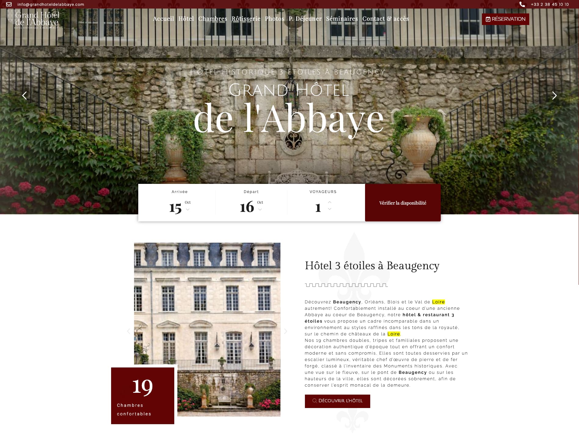
Design immutable templates that cover 90 % of cases: home page, heading page, tag page, topic page, author page, search results and, above all, article page. The article page should contain a breadcrumb trail, a title, a heading, the signature (author, function), the date and time of the update, an indicative reading time, discreet sharing buttons, regular headings, accessible media blocks (captions, transcripts), highlighted quotes and, at the bottom, a relevant recirculation module: articles from the same topic, related analyses, chronologies, or a To Read Next block. To deal with the issue of column widths, margins and visual heights, take inspiration from good sizes for a hotel and adapt the logic to your textual content.
Plan a distinct live blog template: reverse chronology, New Badges, pagination by time slot for performance, and a condensed summary at the top. The section page should act as a hub: lead story + balanced mix of formats (features, videos, columns), filters by sub-theme or actor, and a newsletter insert specific to the section for audience capture. The author page is not cosmetic: it should present the speciality, the latest articles, and a taxonomy of the subjects covered, because many readers follow bylines.
Writing for the screen and attention-grabbing typography
Writing for the screen is a discipline of orientation. Headlines should be no more than 60 characters long for SEO and sharing, headings should be 200 characters long for hooks, and headings every 2-3 paragraphs for reassurance. Lists of facts, key figures and three-point Understanding boxes increase retention. Typographically, aim for at least AA contrast, a line length of 60-80 characters, a line height of 1.5 to 1.7, and fonts that are robust for screen rendering. Manage inverted commas, hyphens, non-breaking spaces and ligatures: microtypography enhances credibility.

The editorial coherence is based on named formats: news, features, analysis, investigation, analysis, report, interview. Each with its own framework, target length and dedicated modules. To feed this calendar, take inspiration from ideas for blog postsA wide range of content: angles, lists, FAQs, guides and thematic files are perfectly suited to the world of information.
Topical SEO and distribution
There's more to referencing media than just keywords. Systematically integrate the structured data Article/NewsArticle, BreadcrumbList and, where applicable, LiveBlogPosting. Publish a sitemap dedicated to news, showing the latest content from the last 48 hours. Work on SEO titles that are distinct from display titles if necessary, take care with headings as natural meta-descriptions, and set clear canonicals to avoid dilution between versions. Enhanced extracts benefit from visuals at least 1200 px wide; standardise your preview images.
Distribution is via RSS feeds by section, daily and themed newsletters, opt-in push notifications, and third-party platforms. Extracts intended for the networks should be written like advertisements: an angle, a figure, a question. Don't forget to align the requirements of Google News and Discover: E-A-T (expertise, authority, reliability), About pages, legal notices, author biographies, and a visible correction process.
CMS, workflow and speed of publication
A good CMS for information has a flexible block editor, lockable templates, quick preview, version management, validation workflow, scheduling and integrations for image editing, transcription, infographics and data embedding. If you're starting out on WordPress, follow a media-focused step-by-step guide to mastering taxonomies, performance and security; you can, for example, create a news site with WordPress by adopting a sober architecture and an optimised theme. For a more general overview of the launch and fundamentals of a media site, read how to create a news website and keep visitors informed while keeping experience at the centre.
The workflow must speed up the chain: from alert to publication, then from update to correction. Design editorial checklists integrated into the editor (title, heading, intertitles, sources, alt text, internal links, structured data, social image, category, tags, topic, author, canonical). Tracking changes and time-stamped updates improves transparency for readers and search engines. Finally, real-time multi-author editing with conflict management reduces friction when the room is publishing fast.
Your quote in 5 minutes
Automation, AI and editorial assistance
AI does not replace writing, but acts as an exoskeleton. Use it to suggest headings, summarise a report, generate alternative titles and headings, suggest tags, extract named entities and speed up the editing of simple images (intelligent cropping). In design, AI can also generate prototypes, fill mock-ups with realistic simulated content, and create variations of modules for testing. To find out more about tools, see how create news and media projects with AI and integrate these assistants directly into the pipeline.
Monetisation without sacrificing experience
Advertising and subscriptions can coexist if you manage the density and stability of the page. Limit intrusive formats, frame placements and maintain large breathing zones around the text. Think viewability without causing CLS; synchronise the loading of ad blocks with section breaks, and set safe areas around headings and media. Subscription paths should be short: an offer page, a form, a payment, a confirmation. Plan flexible paywalls: metered, by type of content, by heading, or by time exclusivity, and integrate structured signals for paid content. Donations and contributions work best when they are linked to concrete projects (surveys, data, local coverage) with genuine progress bars.
Accessibility, reliability and inclusiveness
Media must be accessible. Visible keyboard focus, ARIA roles for complex components (accordions, carousels, live), subtitles and transcriptions for audio/video, high contrast, font size options, and an enhanced reading mode are a foundation. Provide dates in a readable format (day/month/year, local time) and keep critical content accessible in text; avoid conveying information using colour alone. On the live site, announce updates with ARIA politeness and offer user control of refreshes.

Reliability means clear About, Charter and Methodology pages, mention of sources, links to corrections, and author biographies with expertise. A centre of transparency builds trust and encourages subscriptions.
Commitment, recirculation and loyalty
Engagement is more than just the presence of buttons. The What to read next modules should be contextualised by topic, actor, place or format; popular recommendations should exclude the current page and articles that are too old. Thematic newsletters convert better than general ones; place native opt-in points in the templates (at the third reading point, at the bottom of the article, on the heading page). Comments, if open, require AI-assisted moderation and a code of conduct; if not, offer live Q&As or ritual polls.
Off-site, develop distribution plans. For a marketing angle, draw parallels with the promotion of a hotel residenceOn social channels, publish short formats natively. On social channels, publish short formats natively, direct them towards themed hubs rather than the home page, and synchronise newsletters and push messages after highlights.
Communication, brand and editorial voice
The brand is expressed through visual consistency, but above all through the voice. Define a style guide: capitalisation of headlines, levels of neutrality, lead structure, crediting of sources, image policies. Draw up a social kit (templates for reels, carousels, threads), a palette of tones by format (analysis, brief, survey), and a campaign plan for key moments. To ensure consistency across the digital ecosystem, draw on best practice in terms of online communication for a holiday home and apply them to your information meetings.
Measuring, testing and steering
Measure what counts: retention (reading time, scroll depth), engagement (clicks to related articles, newsletter subscriptions), acquisition (Discover, News, search), monetisation (paywall conversion, ARPU), and technical health (Core Web Vitals, crawl errors). Set up real-time dashboards for the room, weekly reports for the verticals, and cohorts to track the effect of redesigns. A/B test headings, the position of recirculation modules, preview visuals and paywall variants. Document the results and integrate them into the design system.
Your quote in 5 minutes
Security, confidentiality and compliance
Protect your infrastructure and reputation. Update the CMS, limit extensions, segment permissions, finely log actions and activate 2FA. In terms of confidentiality, implement an RGPD-compliant CMP, load pixels after consent, and offer a clear preferences centre. Anonymise analytics by default, minimise data collection and explain your policies to readers. On comments and forms, implement safeguards against abuse and a non-intrusive anti-spam plan.
Roadmap: from prototype to operational media
Plan in increments. Increment 1: functional prototype with 3 templates (home, heading, article), taxonomy and basic performance. Increment 2: topic pages, author, search, newsletter, analytics. Stage 3: monetisation, paywall, A/B testing, advanced SEO optimisation. Increment 4: lives, data visualisation, dossiers. For an overview useful to teams, here are the 5 steps to launching a news website to be checked against your context and timetable.
Before going live, prepare a soft launch: redirects, sitemap check, Search Console integration, crawl tests, schema check, load test, accessibility review, and on-call protocol in the event of an incident. Then allow 2 to 4 weeks for hardening to correct what the real readers reveal.
Practical tips that make all the difference
Titles, visuals and data
Headlines: test a maximum of two variants, avoid clickbait, which will lose customer loyalty. Visuals: standardise cropping, limit the use of generic image banks for sensitive subjects, favour explanatory illustrations when photos add little. Data: publish your sources, offer reading notes, explain the definitions of complex terms, and link to the methodologies when handling statistics.
Internal links and meshing
Link your content intelligently. Insert a maximum of 3 to 5 contextual links per article, avoiding links to headings if a topic page exists. Topic hubs serve as a secondary home for SEO and recirculation. To-read boxes should be specific and dynamic, not a generic block duplicated everywhere.
Special pages and events
Prepare templates for elections, crises and major sporting events. These pages require a chronology, a map, key figures, a live feed and an Understand box. Anticipate the load and deactivate non-essential modules temporarily. Document these templates so that you can reactivate them with just a few clicks.
Resources, training and support for teams
Train the editorial team in the CMS, SEO check, accessibility and basic security. Create a component library and a user guide with screenshots and short videos. Define contact points: one channel for incidents, one for template requests, one for upgrades. Playbooks reduce variability and free up time for investigation and analysis.

If you lack the resources, you can outsource certain phases: integration, performance optimisation, SEO and accessibility audits, or the creation of prototypes. For a quick, detailed estimate, please contact get a quote in 5 minutes to prioritise your roadmap.
In short: a readable, fast, reliable medium
Give precedence to orientation over ornament. A homepage that tells the story in clear modules, quick and readable article templates, strict taxonomy, solid structured data, a fluid and secure CMS, intelligent distribution and constant respect for the reader's attention form the basis of a modern medium. The most powerful design choices are often invisible: the stability of the layout, the clarity of the titles, the coherence of the modules, the discretion of the ads, the responsiveness of the pages at a glance, the trust inspired by transparency. Building this foundation is less a question of fashion than of the discipline of prioritisation, measurement and iteration.
With this framework, you can iterate serenely: launch a minimal viable newsroom, observe, adjust, reinforce and, when the audience consolidates, add the formats and experiences that make sense for your editorial line. A sustainable media is based on a design that respects the reader as much as the information itself.


 Hotel Web Design is a Google partner with the Google Hotelsincluding our customers benefit on a daily basisGoogle search: information about your accommodation, availability and prices is sent continuously to the search engine, which displays free booking links from the Google search directly to your booking page. These free links represent around 15% of additional commission-free bookings for our customers in 2022! Read our article on free booking links from Google
Booking / reservation website
-
Booking services for hotels and holiday rentals
- Turnkey site with administration interface training on delivery
- Adapted logo and graphic charter. Possibility of using your existing elements
- Hospitality SEO
- Integration of reservations module
- or integration of an external booking engine (Reservit, Availpro, Mister booking, Roomcloud, etc)
- Integration of specific HTML elements (review portals, customer reviews, weather, press, pop-ups, direct chat, etc.)
- Secure SSL / HTTPS
- Multilingual
- Website user interface
- Hosting and domain name
- Fast delivery
Hotel Web Design is the web agency 100% dedicated to the hotel industryWe can help you with all aspects of digital communication for your accommodation: booking websites, natural referencing specialising in the hotel industry, Google Ads referencing and Google Hotel Ads, social networking campaigns, graphic charters and logos for hotels.
Make an appointment today for free advice on how to optimise the digital management of your accommodation.


