
visual hierarchy web design
Get people to understand what to watch in 3 seconds
On the Web, users don't read: they scan. Your interface is judged in a matter of seconds, often even before the first scroll. Visual hierarchy involves orchestrating signals (size, contrast, position, rhythm, space) so that the eye instantly understands: 1) what the main message is, 2) what action is expected, 3) what information supports the decision.
In practical terms, the objective is not just aesthetic. It's about efficiency: reducing cognitive effort, avoiding hesitation, preventing dispersion, and increasing conversions without forcing the user. If the eye doesn't know where to land, the experience becomes tiring and credibility declines, even if the content is good.
Starting with an intention: the journey before formatting
A solid hierarchy doesn't start in Figma, but in the logic of the course. Ask three questions before styling anything:
1) What is the main purpose of this page (get information, compare, book, contact, register)?
2) What is the decisive factor in moving forward (CTA, form, price, proof, benefit)?
3) What objections need to be overcome, and in what order (trust, availability, compatibility, timeframe, guarantees)?
Then you translate this mental order into visual order. This approach avoids a common pitfall: creating a beautiful page where everything is important, but nothing really is.

Fundamental levers: size, contrast, position, space
Size: prioritising without outbidding
Size is the most direct signal. A larger headline attracts attention, a larger button seems more actionable, a more prominent figure adds weight. The trap is to make everything bigger: if everything gets bigger, the page screams and the eye gets tired.
Use a consistent typographic scale (e.g. 16/20/28/40) and limit the number of levels. Two or three levels of clearly differentiated headings are often enough to structure a marketing page.
Contrast: making the important obvious
Contrast is not just about colour. It includes: value contrast (light/dark), saturation contrast, shape contrast (rounded vs. angular), density contrast (airy vs. busy), and typographic contrast (bold, capitals, lettering).
A good idea: if you change your design to greyscale, the call to action and key messages should still be immediately recognisable. Contrast is also a question of accessibility: low-contrast text is illegible on a mobile phone, especially outdoors.
Position: reading order as a conversion tool
Users often follow scan patterns (F-pattern, Z-pattern), but above all they obey the layout. Place the essentials above the waterline without cramming everything in: promise, main benefit, element of trust, action.
Proximity is a signal: what is close is perceived as related. A label, a price, an option and a button must form a unified block, otherwise the user will be in doubt: what does this button correspond to?.
Space: the silence that makes the message speak
Space (margins, padding, line spacing) is the most underestimated tool. It's not a vacuum: it's a way of separating groups, creating rhythm and giving importance. The more space an element is surrounded by, the more significant it appears.

Hotel Web Design is a Google partner with Google Hotels :
your availabilities and prices are continuously sent to Google, which displays free booking links to your booking page.
These links can represent around 10% to 15% additional commission-free bookings. Read the article on
Google's free booking links
.
A layout that is too dense forces the user to decode. A layout that is too airy can give the impression of a lack of content. Balance is achieved by treating space as a design unit in its own right, in the same way as colour.
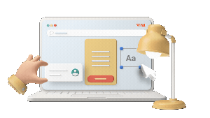
Typography: transforming text into a visual journey
Typography is often at the heart of the hierarchy, as the Web is predominantly text-based. The practical rule: the user must understand the structure by looking only at the titles, subtitles, lists and highlights.
Work on :
Fat Use it to highlight pivotal words (benefits, figures, guarantees) rather than whole sentences.
Line length A line that is too long is tiring; a line that is too short makes reading difficult. Aim for a comfortable width, especially for paragraphs.
Line spacing Increase it slightly to improve legibility, particularly on mobile devices.
Coherence Two fonts are more than enough (one for titles, one for text), sometimes just one. The more styles you use, the more you dilute the hierarchy.
For a summary of the principles applied to the Web, see visual hierarchy in website design, which illustrates how visual cues guide reading.
Colour and branding: guiding without distracting
Colour should have a role, not just an ambience. A common and effective scheme:
1 accent colour reserved for the main actions (and a few navigation elements)
1 secondary colour to distinguish categories or states (info, success, warning)
Neutrals for background and text
Avoid using the accent colour for everything: badges, links, pictograms, highlighting... otherwise the CTA will drown. Hierarchy works when exceptions are rare. A primary action should be the most visible exception.
Forms, icons and imagery: hierarchy through narrative
Images attract faster than text. So: if your main visual doesn't support the promise, it diverts attention. Use imagery to clarify: a product in situation, a result, a capture, proof. Icons can speed up comprehension, but only if they are consistent (style, thickness, size) and associated with short wording.
Shapes (maps, boxes, alternating sections) are powerful separators. However, a page made up of uniform cards can flatten out the importance: if all the cards are the same, the user won't know what to choose. Introduce a highlighted card (size, contrast, position) to create a guided choice.

Grids and page layout: making the hierarchy robust
A solid hierarchy resists variations: mobile screens, longer content, translation, marketing changes. This is where the grid is decisive: it imposes an order, aligns the elements and makes the design predictable, and therefore easier to scan.
If you would like to formalise these structural principles (sections, columns, alignments), the article The basics of site design using grids, sections and columns helps you to design layouts that prioritise naturally, without relying on excessive visual effects.
Micro-hierarchy: the details that avoid friction
Beyond the big blocks, the micro-hierarchy is what makes the experience flow:
Labels and fields the label must remain clear even when the user is typing (avoid using placeholders as the only reference).
Visual states hover, focus, errors, success. If these states are not prioritised, the user does not understand what is happening.
Information priority In a product card, the name, benefit, price and action should be more visible than the secondary details.
Repeat recurring patterns (same components, same spacing) reduce the need to learn the interface.
This micro-hierarchy is often what differentiates a pretty site from one that really performs.
Hierarchy and persuasion: giving weight to evidence
Persuasion in web design is not a question of slogans, but of prioritisation: showing the right proof at the right time. The elements of trust (opinions, customer logos, figures, guarantees, labels, policies) must be visible without overwhelming the message.
A common pattern: promise → benefits → proof → action. If you put the proof in too early, it lacks context. Too late, and the user will already have doubted it. For a more in-depth look at the idea of decision-oriented design, see the article a more persuasive website thanks to visual hierarchy is a good example of how visual order can support argument.
Adapting the hierarchy to the type of site: marketing pages, e-commerce, media, etc.
Landing page: one action, one story
A high-performance landing page doesn't propose ten objectives. It tells a story of progression: clear hook, benefit, proof, details, FAQ, repetition of the CTA. The hierarchy should make this progression inevitable: each section answers an implicit question, in the right order.
Hotel Web Design is the 100% web agency dedicated to the hotel industry, supporting you in all aspects of digital communication: booking websites, natural search engine optimisation specialising in the hotel industry, Google Ads and Google Hotel Ads, social networking campaigns, graphic charters and logos.
Make an appointment today for free advice on optimal digital management.
E-commerce: comparison and reassurance
On a category page, the hierarchy should facilitate mental sorting: visible filters, comparable information, consistent photos, immediately recognisable price and availability. On a product page, the purchase must be the dominant element, but reassurance (returns, delivery, security) must remain close at hand, otherwise the user will go back to look for the information elsewhere.
News site: controlled density
Content and news sites need to manage a lot of information without losing the user. The hierarchy is based on levels: headlines, then sections, then lists. Titles, thumbnails and metadata (date, author, category) must be calibrated to avoid a wall of links.
For best practices specific to this context, The basics of news website design provides useful pointers for structuring dense pages while keeping them easy to read.
Visual effects: reinforcing the hierarchy without replacing it
Animations can clarify a priority (draw attention to a change of state, guide a progression), but they must not compensate for a weak structure. Too much effect steals attention away from the content. Use them as accents: short, intentional, consistent.
Parallax, for example, can help to tell a story and separate sections, as long as legibility and performance are preserved. If you're exploring this, Create superb parallax scrolling effects in web design shows how to make the most of it without damaging the message.
Practical (and easy to apply) rules for improving an existing page
If you are taking over a site that is already online, here are some high-impact actions:
1) Reduce the number of strong elements A single main CTA per screen, a single dominant headline, a single really useful hero image.
2) Create a typographic scale harmonise sizes and weights so that each level has a clear role.

3) Enhancing the contrast of the CTA reserved accent colour, surrounding space, benefit-oriented wording.
4) Grouping by proximity What goes together must be visually glued together; what is different must be separated by a space or section background.
5) Testing the squint test squint your eyes. The masses should have an obvious structure (title, benefits block, proof, action).
To complete the picture, here's a set of general principles that are useful when you want to tidy up an interface, Web Design: 8 Golden Rules for Beginners brings together simple rules that work well with a hierarchical approach.
The most commonly used hierarchy rules (and how to translate them into UI)
Certain rules recur in almost all good designs:
Dominance An element must win out clearly (title, offer, action). UI translation: size + contrast + space.
Repeat UI translation: stabilises the interface. UI translation: same components, same button styles, same card templates.
Alignment UI translation: makes it easy to read. UI translation: grid, constant margins, clean visual lines.
Contrast Priority: makes the priority obvious. UI translation: colour, fat, density, alternating backgrounds.
Proximity creates units of meaning. UI translation: blocks, spacing, subtle separators.
For a wider list of rules and variations applicable to graphic design (often transposable to the UI), Graphic design: 12 rules of visual hierarchy provides an interesting basis for enriching your choices.
When the hierarchy breaks down: symptoms and rapid diagnosis
You can spot a hierarchy problem without analytics :
Too many different styles Fonts, sizes, colours and shadows are all over the place.
Invisible CTA It's there, but it doesn't stand out against the secondary links and badges.
Interchangeable sections Everything has the same weight, no anchor points.
Key information too late : prices, conditions, availability, tangible benefits hidden beneath the text.
Neglected mobile On a small screen, priorities get mixed up, blocks become too long and navigation takes over.
In these cases, simplifying (removing, regrouping, clarifying) is often more effective than adding new elements.
AI, personalisation and hierarchy: keeping a grip on priorities
AI can help to generate content variants, adapt components or test page layouts, but it is no substitute for intention. A personalised page must maintain a stable structure: if the priority changes with each visit, the user loses his bearings.
Your quote in 5 minutes
To understand how modern approaches fit into the design process (without turning design into a black box), you can read Neural networks and deep learning for AI in design.
Quick case study: advertising, branding and landing pages
A coherent visual hierarchy doesn't just live on the page, it often starts beforehand, in the advert or the acquisition context. If a campaign highlights a promise, the page must take up this promise first, then detail it, then prove it, then get people to act on it. Otherwise, you create a rupture: the user doubts, and the hierarchy doesn't take.
In the travel sector, for example, competition on brand queries and comparators have a strong influence on the customer journey. Understanding these mechanisms helps you choose what to highlight (price, availability, direct benefit, reassurance). On this point, How Booking leverages hotel brands with Google Ads provides a useful insight into the impact of the advertising context on the way a page is structured.
Final checklist: building a hierarchy that converts
Main message In one sentence, easy to understand without scrolling.
Main action Visible, high contrast, repeated in the right places.
Typographic scale 2-3 levels of titles, consistent styles.
Grid clean alignments, constant spacing, clean sections.
Evidence : placed after profits, before the heavy details.
Accessibility sufficient contrast, legible sizes, visible keyboard focus.
Mobile same priority, but with a simplified layout and shorter blocks.
To go further and apply these principles to your site (redesign, landing page, conversion optimisation), you can schedule a meeting via Your quote in 5 minutes.
Summary resource on the importance of hierarchy
If you want an overview of site design (with examples and a UX angle), The role of visual hierarchy in site design complements the principles set out here.


Hotel Web Design is a Google partner with the Google Hotelsincluding our customers benefit on a daily basisGoogle search: information about your accommodation, availability and prices is sent continuously to the search engine, which displays free booking links from the Google search directly to your booking page. These free links represent around 15% of additional commission-free bookings for our customers in 2022! Read our article on free booking links from Google
Booking / reservation website
-
Booking services for hotels and holiday rentals
- Turnkey site with administration interface training on delivery
- Adapted logo and graphic charter. Possibility of using your existing elements
- Hospitality SEO
- Integration of reservations module
- or integration of an external booking engine (Reservit, Availpro, Mister booking, Roomcloud, etc)
- Integration of specific HTML elements (review portals, customer reviews, weather, press, pop-ups, direct chat, etc.)
- Secure SSL / HTTPS
- Multilingual
- Website user interface
- Hosting and domain name
- Fast delivery
Hotel Web Design is the web agency 100% dedicated to the hotel industryWe can help you with all aspects of digital communication for your accommodation: booking websites, natural referencing specialising in the hotel industry, Google Ads referencing and Google Hotel Ads, social networking campaigns, graphic charters and logos for hotels.
Make an appointment today for free advice on how to optimise the digital management of your accommodation.


