
destination page
Aligning the promise with the intention: the basis for conversions
A high-performance landing page doesn't convince a visitor who's hesitating: it confirms at high speed that he's in the right place. Conversion depends first and foremost on the alignment between the source of traffic (advert, email, social post, SEO, partnership) and the promise visible above the waterline. If someone clicks on a 14-day free trial ad, your first screen should repeat exactly that idea, without detours or jargon.
The key point: every word that does not serve the user's intention creates micro-friction. Conversely, perfect continuity (message match) reduces cognitive effort and mechanically increases the action rate. In concrete terms, use the same terms as the acquisition channel: same benefits, same offer, same timeframe, same audience (for SMEs, for sales teams, etc.). Avoid vague titles (Discover our solution) and focus on a specific promise (Reduce your quote times from 30% in 7 days).
Winning structure: funnel reading
Most high-converting pages follow a funnel logic: 1) capture attention, 2) prove value, 3) reduce risk, 4) guide to a single action. This progression must be visible, scanned and consistent from top to bottom. A good page can't be read like an article: it has to be scanned. So your design must make it easy to understand in just a few seconds.

To reinforce this journey, work on the hierarchy of elements: size of headings, contrasts, spacing, highlighting the value proposition, then evidence (figures, logos, opinions), then details, then FAQs and finally the CTA. If you'd like to find out more about how to orchestrate this reading, have a look at Mastering the visual hierarchy in Web design.
The first screen: title, subtitle, evidence, action
Above the waterline, you should ideally have: a results-oriented headline, a sub-heading that specifies for whom and how, a piece of evidence (note, figure, client logo, media mention) and a clear action button. The aim is not to explain everything, but to make the point clear and the next step obvious.
A single main action (and controlled outputs)
The more options you offer, the more you dilute attention. An effective landing page targets one main action: request a quote, book a call, download a guide, register. Secondary links (legal notice, privacy policy) can exist, but they shouldn't shout louder than your CTA. Avoid complete menus and links to ten sections: keep the visitor in the tunnel.
Copywriting: talking benefits, not features
Many pages fail not because of the design, but because they describe a product instead of selling a result. Visitors ask simple questions: What's in it for me? is it for me? is it credible? what does it cost me (money, time, effort)? Your text should answer these questions, in this order.
An effective method is to formulate your arguments in three layers: main benefit (result), mechanism (how), proof (why to believe). Example: Generate more qualified requests (benefit) thanks to an optimised and tested page (mechanism), validated by A/B data (proof). Then, detail the features only if they support the result. Functionality is not the destination; it is the vehicle.

Hotel Web Design is a Google partner with Google Hotels :
your availabilities and prices are continuously sent to Google, which displays free booking links to your booking page.
These links can represent around 10% to 15% additional commission-free bookings. Read the article on
Google's free booking links
.
For additional performance-oriented advice, you can read Improve the conversion rate of your home page ....
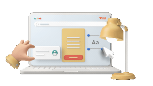
Visuals and layout: show, guide, reassure
Visuals are not decoration: they must reduce uncertainty. If you're selling software, show the interface in an understandable context, with benefit-oriented annotations. If you're selling a service, show the deliverable (extracts, mock-ups, before-and-after examples) and above all the end result. A good visual tells you what it looks like and how I use it.
The layout should guide the eye towards the action: short blocks, clearly separated sections, bulleted lists for key points, sufficient white space, and repetition of the CTA after the proof sections. Users don't read everything: give them visual cues.
Typography: legibility, credibility, rhythm
Confusing typography destroys confidence. Limit yourself to 1 or 2 fonts, ensure high contrast, a comfortable text size and a reasonable line length. Headings should structure the page, not just look pretty. The rhythm (headings, intertitles, short paragraphs) has a direct impact on the time it takes to understand the offer.
If you want to explore the impact of automation on font choice and typographic harmonisation, see L rsquo influence l rsquo IA on typography and typefaces.
The form: reducing effort to the minimum necessary
The form is often the bottleneck. Every field is a cost. The practical rule: only ask for what you need to deliver the promise. If the objective is a demo, the first name and email may be enough to start with, and then add to it later. If the objective is a quote, you can ask for additional information, but structure it intelligently (progressive, multiple choices, short steps).
Frequent optimisations: clear wording, useful error messages, auto-completion, masking of irrelevant fields, and reassuring microcopy (Response within 24 hours, No spam, Cancellation possible). The user must feel that the effort required is proportional to the gain promised.
CTA: explicit action, reduced risk
A good button is not Send. It describes the next step (Receive the quote, Book my audit, Access the guide). Add a reassuring phrase around it: duration, confidentiality, commitment. The colour of the button is less important than the overall contrast and clarity of the proposal.

If your aim is to turn an intention into an immediate contact, you can make a simple appointment via Your quote in 5 minutes.
Proof and reassurance: transforming mistrust into confidence
Conversions increase when the page anticipates objections. Social proof and trust signals need to be specific and verifiable: signed reviews, case studies, before/after figures, (real) customer logos, result captures, certification, guarantees and security mentions if payment is made. Vague evidence (thousands of satisfied customers) is less helpful than specific evidence (+42% leads in 30 days, B2B sector).
Place proofs close to the decision-making moments: near the CTA, near the form, and in the sections where you ask for a commitment (price, trial, appointment). A well-written FAQ also plays this role: it reduces the support load, while giving the visitor the impression of being understood.
For more concrete ideas to boost performance, see Landing Page: 5 secrets for boosting conversion to 50%.
Mobile-first: conversion often takes place on the small screen
On mobile, the slightest friction becomes fatal: buttons that are too small, tight text, endless sections, long loading times, intrusive pop-ups. Think thumb: accessible CTAs, easy-to-fill fields, simplified menus and prioritised content. Mobile-first is not just a responsive adaptation; it's a more aggressive hierarchisation of information.
Another essential point: speed. Compress images, avoid unnecessary scripts, and prefer lightweight components. Slow pages lose conversions even before the visitor has understood your promise. To find out more about the modern, automation-assisted approach, see Optimising web design for mobile devices using AI.
Customisation and consistency by sector: adapting the level of detail
A landing page is not universal: expectations vary depending on the sector, the average shopping basket and the prospect's level of maturity. The bigger the decision (high budget, perceived risk), the more proof, detail and reassurance you need to provide. Conversely, for a simple offer (registration, free resource), conciseness is key.
Hotel Web Design is the 100% web agency dedicated to the hotel industry, supporting you in all aspects of digital communication: booking websites, natural search engine optimisation specialising in the hotel industry, Google Ads and Google Hotel Ads, social networking campaigns, graphic charters and logos.
Make an appointment today for free advice on optimal digital management.
Example: in the automotive sector, visitors want structured information (models, finishes, financing, trade-ins) and elements they can trust (location, reviews, availability). Clarity and the presentation of options play a big part in conversion. For design ideas adapted to this type of activity, read Design basics for car dealerships.
Another example: in entertainment, the aim may be to maximise immediate engagement (registration, booking, ticket purchase) with a more immersive aesthetic, but without sacrificing readability or speed. Effective pages here often use strong visuals, visible social proof, and a very short purchase path. For a more specific angle, see How to design entertainment websites.
A/B tests: optimising by method rather than by feel
The design that appeals is not always the one that converts. A/B tests are used to isolate a variable and measure its impact: title, order of sections, proof format, length of form, CTA wording, main visual, addition of a guarantee, etc. The classic mistake is to change everything at once, then lose track of what really improved (or worsened) performance. The classic mistake is to change everything at once, and then no longer know what has really improved (or worsened) performance.
Prioritise your tests according to potential impact and effort: first the first screen (promise, CTA, proof), then the form (fields, friction), then the reassurance sections (FAQ, testimonials), and finally the finer elements (colours, pictograms). Document each hypothesis: if we make the promise more specific, then clicks on the CTA will increase because the offer will be clearer. Then measure with sufficient volume to avoid jumping to conclusions.
For a creative framework geared towards lead generation and efficiency, you can also consult How to create a high-converting landing page.
Elements often underestimated: microcopy, FAQ and anxiety

Conversion rates are often won on the details. The microcopy (small phrases near a field or button) defuses fears: You can modify later, No card required, Response in less than an hour. The FAQ answers objections without forcing an exchange: deadlines, rates, compatibility, conditions, cancellation, confidentiality.
Treat the FAQ as a sales tool, not an appendix. Include the questions your prospects actually ask. If you don't have this information, collect it: sales calls, support tickets, chat, comments, appointment objections. Every repeated objection deserves a clear answer on the page.
Tools and production: creating quickly without sacrificing quality
Performance doesn't necessarily depend on lengthy development. You can produce a clean, fast and testable page with tools that facilitate formatting, analytics and iteration. The important thing is to retain control over the structure (first screen, proofs, CTAs), speed and mobile experience.
If you're looking for a quick-start solution, you can try Create a free landing page in just a few moments, and then iterate according to the results (sources of traffic, CTA click rate, completion rate, quality of leads).
Final checklist: the criteria for a page that converts
Before publishing (or relaunching a campaign), check these points: the promise is identical to that of the ad; the first screen contains the title, benefit, proof and CTA; only one main action is highlighted; the proofs are specific; the form is short and clear; major objections have an answer (FAQ); the page loads quickly and can be used on the fly; the design guides the eye to the action; tracking is in place to measure and test.
At the end of the day, a landing page with a high conversion rate is not a pretty page, but a frictionless decision path: a clear message, credible evidence, minimal effort and obvious action.


Hotel Web Design is a Google partner with the Google Hotelsincluding our customers benefit on a daily basisGoogle search: information about your accommodation, availability and prices is sent continuously to the search engine, which displays free booking links from the Google search directly to your booking page. These free links represent around 15% of additional commission-free bookings for our customers in 2022! Read our article on free booking links from Google
Booking / reservation website
-
Booking services for hotels and holiday rentals
- Turnkey site with administration interface training on delivery
- Adapted logo and graphic charter. Possibility of using your existing elements
- Hospitality SEO
- Integration of reservations module
- or integration of an external booking engine (Reservit, Availpro, Mister booking, Roomcloud, etc)
- Integration of specific HTML elements (review portals, customer reviews, weather, press, pop-ups, direct chat, etc.)
- Secure SSL / HTTPS
- Multilingual
- Website user interface
- Hosting and domain name
- Fast delivery
![]()
Hotel Web Design is the web agency 100% dedicated to the hotel industryWe can help you with all aspects of digital communication for your accommodation: booking websites, natural referencing specialising in the hotel industry, Google Ads referencing and Google Hotel Ads, social networking campaigns, graphic charters and logos for hotels.
Make an appointment today for free advice on how to optimise the digital management of your accommodation.


