increase direct bookings
Reassure before convincing: direct booking is a matter of trust
When a traveller hesitates between your website and an OTA, it’s not always a question of price. Very often, it’s a question of perceived risk: fear of getting the date wrong, not being able to cancel, not being refunded, not having assistance, or simply not being certain that the booking has been properly processed. Platforms have accustomed the public to very reassuring cues (instant confirmation, reviews, customer service, one-click cancellation). So, to get people to book direct, you need to replicate — and surpass — these signals of security.
The aim isn’t to copy Booking, but to make your direct channel as simple, clear and safe as what your prospects already know. A good hotel website is a silent salesperson: it doesn’t push, it reassures.
Removing the most common barriers to direct booking
To reassure effectively, start by identifying what’s blocking. In most cases, the friction points are very concrete:
1) Doubts about reliability : What if I pay and it glitches?

2) Lack of clarity : cancellation conditions, taxes, breakfast, arrival times…
3) Effort : too many steps, forced account creation, long forms.
4) Comparison : Am I sure I’m getting the best rate?
5) Fear of making a mistake : dates, number of people, room type.
In practice, some of these barriers come from the design and booking journey, and another part from your messaging (the proof, the transparency, the guarantees). If your site attracts traffic but doesn’t convert, there’s a good chance the obstacle lies precisely there: Why your website isn't converting despite good traffic.
Show proof of reliability (not promises)
Display visible trust signals, immediately
The visitor must understand within a few seconds that they’re in the right place and that they can book without fear. The most effective signals are simple:
• Clear identity : name of the establishment, address, telephone, email, access, reception hours.
• Clickable contact details on mobile : one click to call, one click to send an email.
• Legal notice and privacy policy easily accessible (without jargon).
• Secure payment label (3D Secure, recognised PSP), displayed close to the payment — not tucked away in the footer.
Use social proof… in the right place
Reviews reassure, but their placement is crucial. Avoid the standalone Reviews page that nobody reads. Prefer:
• Review excerpts near anxiety-inducing elements: when choosing a room, just before payment.
• Overall ratings visible from the homepage and the room pages.
• Thematic reviews (cleanliness, bedding, location, welcome) to address real concerns.
Add real-world proof
Travellers aren’t just looking for stars: they’re looking to picture themselves. Reassure them with:

Hotel Web Design is a Google partner with Google Hotels :
your availabilities and prices are continuously sent to Google, which displays free booking links to your booking page.
These links can represent around 10% to 15% additional commission-free bookings. Read the article on
Google's free booking links
.
• Authentic photos (rooms, bathroom, common areas, parking, access).
• Practical information (works, PRM access, possible disturbances, opening hours): transparency builds trust.
• A short FAQ focused on objections (late arrival, luggage storage, pets, baby cot, billing).
Make the booking journey as smooth as an OTA
The best pitch doesn’t make up for a clunky booking engine. If the visitor gets lost, hesitates or has to start again, they’ll go back to a platform. Here are the pillars of a journey that reassures:
Reduce the number of steps and fields
Every extra click increases the likelihood of abandonment. Aim for a simple path: dates → room selection → options → contact details → payment → confirmation. Avoid endless forms and anything that isn’t strictly necessary for the booking.
To go further in optimising the journey, you can draw on concrete best practices: A faster direct booking process in 7 ….
Ensure mobile consistency (and not just responsive design)
Many sites display on mobile, but remain awkward to use: tricky calendar, buttons that are too small, intrusive pop-ups. Yet on a smartphone, trust is fragile: if the interface annoys, it worries (if the site is flimsy, the payment will be too).
Simple checklist: clearly visible action buttons, an easy calendar, a permanent stay summary, and a frictionless payment form.
Give visibility on the final price, immediately
Surprise fees destroy trust. Clearly display:
• the total (including taxes and fees),
• what is included (breakfast, parking, spa access…)
• the associated conditions (cancellable/non-cancellable, prepayment, security deposit).
Be clearer than the OTAs about the terms (cancellation, payment, changes)
Travellers book on platforms because they quickly understand what they risk in the event of an unexpected issue. On your website, the readability of your terms is a major lever for reassurance.
Translate your terms into plain language
Instead of a legal block, use short, structured sentences:
• Free cancellation until…
• Then: …% of the stay
• Payment: … at the time of booking / on arrival
• Changes: possible until…
Add a one-line summary on each rate: Cancellable until D-2 — payment on site or Non-refundable — immediate payment. It’s simple, but extremely reassuring.
Offer options that reduce the perceived risk

If your model allows it, offer two rates: a flexible one (more expensive) and a non-refundable one (cheaper). The traveller chooses according to their level of security. The important thing is to make the choice obvious, with a clear comparison table.
Guarantee direct booking: better value, not necessarily cheaper
Many establishments think they need to beat the platforms on price. But trust is also built with a direct value proposition: clearer, more advantageous, more human.
Highlight concrete direct benefits
Benefits must be immediate, understandable and credible:
• Free breakfast or preferential rate
• Upgrade subject to availability
• Late check-out
• Best room assigned (priority)
• More flexible policy than on OTA
Avoid vague advantages (unique experience). Prefer measurable benefits.
Reassure with a smart parity promise
Without getting into a price war, you can reassure by explaining your pricing logic: The official website offers our best conditions and exclusive benefits. The idea is to make it clear that booking direct is not a gamble.
To delve deeper into the levers that can improve direct channel performance, here is a useful resource: How to increase your direct bookings?.
Humanise: quick access to a real person is a trust accelerator
OTAs win with machines; you can win with humans. A reassured visitor is often a visitor who knows they can get a quick answer.
Make contact visible without breaking the journey
Display:
• a clickable number (mobile),
• a clear email address,
• response hours (Response in under 2 hours from 9am to 7pm).
If you use a chat, avoid aggressive pop-ups. Prefer a discreet widget, with a helpful message (A question about cancellation conditions?).
Create micro-reassurances at the right time
A few examples that work very well:
• Immediate email confirmation at the time of payment
• No surprises: taxes included in the summary
• Need a business invoice? at the time of entering contact details
They are short phrases, but they address big worries.
Refine the site + booking engine duo: technology influences trust
A slow site, an engine that opens in a new window, an inconsistent interface, or a generic design can trigger immediate mistrust. Trust is also a perception of competence.
Hotel Web Design is the 100% web agency dedicated to the hotel industry, supporting you in all aspects of digital communication: booking websites, natural search engine optimisation specialising in the hotel industry, Google Ads and Google Hotel Ads, social networking campaigns, graphic charters and logos.
Make an appointment today for free advice on optimal digital management.
On this point, many establishments run into limits when the site is made by a non-specialist agency, or when the booking engine is bolted on without thinking about the user experience. To avoid these mistakes, this piece is enlightening: Hotel website and booking engine: what generalist agencies forget.
Avoid breaks in trust
Examples of breaks that make people leave:
• Abrupt design change between the site and the booking engine (impression of a dubious redirection)
• Lack of a clear summary before payment
• Technical errors (inconsistent availability, promo codes that do not work)
• Loading time too long on mobile
Reducing post-booking anxiety: confirmation, follow-up, and evidence
Trust doesn’t stop at the moment you click Book. A customer who receives clear confirmation and reassuring follow-up will have fewer cancellation requests, fewer disputes, and a greater chance of booking direct next time.
Send an exemplary confirmation
Your confirmation email must include:
• booking number,
• dates and number of people,
• address + directions (clear text),
• cancellation conditions in a short version,
• reminder of services (breakfast, parking, spa),
• direct contact in case of questions.
Pre-arrival: reassure and simplify
A message 48–72 hours before arrival can significantly reduce uncertainty: times, door code if necessary, parking, online check-in if you offer it, request for arrival time. The aim: show that everything is under control.
Talk about the why: explain the benefit of booking direct, without guilt-tripping
Some hoteliers dare to send a message like “book direct to support us”. This can work, but only if the tone is right and the customer benefit is obvious. Travellers don’t want to be guilt-tripped; they want to be reassured and rewarded.
A more effective approach: explain that booking direct enables a simpler relationship (changes, special requests, better room allocation) and often exclusive benefits. In fact, the demand is there: more and more travellers want to avoid intermediaries when it’s simple and safe. To understand this trend and make better use of it: Travellers want to book without intermediaries.

Put OTA costs into perspective (and invest where it converts)
Reassuring also means being able to finance an impeccable direct experience. Many establishments underinvest in their website because they see the OTA as a necessary evil. Yet, part of the budget goes each month in commissions, when it could strengthen the direct channel (better website, better photos, smoother booking engine, more compelling content, better-targeted campaigns).
If you want to objectively assess the impact of commissions on profitability and on your ability to invest, this read is useful: The true cost of Booking and Airbnb commissions on a hotel’s profitability.
When a redesign becomes a reassurance lever (and not just a new design)
Sometimes, you can add labels, rewrite terms and conditions, improve photos… but if the site structure, the booking engine, mobile performance and information hierarchy don’t keep up, trust doesn’t increase. A useful redesign isn’t cosmetic: it puts conversion and reassurance at the centre.
To understand how a redesign can concretely reduce dependence on platforms, here’s some relevant content: How a website redesign can reduce your dependence on OTAs.
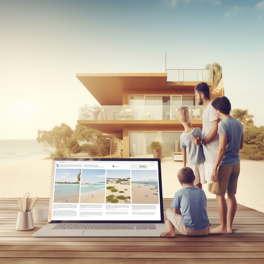
The website: your reception desk open 24/7
Your website isn’t a brochure. It’s where the traveller makes their decision, often late at night, without being able to call. So it’s your digital reception desk. Independent hotels, in particular, have an advantage: their authenticity and their ability to personalise the experience. But that must come across in a fast, clear, reassuring site geared towards booking.
If you’re still hesitating about the priority to give this investment, this point of view can help you: Why independent hotels have every reason to invest in their website.
Actionable checklist: 12 elements that reassure and drive direct bookings
1) Clickable phone number and visible reception hours
2) Clear cancellation conditions next to each rate
3) Total price shown early (taxes included)
4) Real, plentiful photos (rooms, bathroom, access)
5) Reviews visible near the pages that convert
Your quote in 5 minutes
6) Booking engine with no visual break
7) Short journey, without mandatory account creation
8) Secure payment explained (and not just a logo)
9) Immediate confirmation and a comprehensive email
10) Concrete direct advantages (not slogans)
11) Anti-objection FAQ (parking, late arrival, pets…)
12) Flawless mobile performance (speed + ergonomics)
Take action: secure your direct channel with a clear plan
Reassuring isn’t about adding a “secure payment” line and hoping it works. It’s a coherent whole: a smooth journey, visible proof, transparency, and accessible support. The good news is that these are often incremental improvements, measurable, and very profitable.
If you want a quick opinion on the priorities to put in place (site, booking engine, reassurance, conversion), you can ask Your quote in 5 minutes.


Hotel Web Design is a Google partner with the Google Hotelsincluding our customers benefit on a daily basisGoogle search: information about your accommodation, availability and prices is sent continuously to the search engine, which displays free booking links from the Google search directly to your booking page. These free links represent around 15% of additional commission-free bookings for our customers in 2022! Read our article on free booking links from Google
Booking / reservation website
-
Booking services for hotels and holiday rentals
- Turnkey site with administration interface training on delivery
- Adapted logo and graphic charter. Possibility of using your existing elements
- Hospitality SEO
- Integration of reservations module
- or integration of an external booking engine (Reservit, Availpro, Mister booking, Roomcloud, etc)
- Integration of specific HTML elements (review portals, customer reviews, weather, press, pop-ups, direct chat, etc.)
- Secure SSL / HTTPS
- Multilingual
- Website user interface
- Hosting and domain name
- Fast delivery
![]()
Hotel Web Design is the web agency 100% dedicated to the hotel industryWe can help you with all aspects of digital communication for your accommodation: booking websites, natural referencing specialising in the hotel industry, Google Ads referencing and Google Hotel Ads, social networking campaigns, graphic charters and logos for hotels.
Make an appointment today for free advice on how to optimise the digital management of your accommodation.


