Selling more, faster, with a clear path
design concessionnaire automobile - In a dealership, design is not just an aesthetic varnish: it's a performance tool. Every visual element (signage, zoning, lighting, furniture, digital interface, sales documents) must reduce friction and speed up the decision. The objective is simple: to guide a prospect from I look to I sign, without rushing them, but without losing them.
The basic idea is to design a coherent experience across three interrelated environments: the outdoor park (first impression), the showroom (projection and reassurance), and the transaction area (trust, confidentiality, efficiency). Then there's the digital extension: website, appointment booking, forms, chat, and follow-ups. A well-designed dealership showcases the range of products on offer, clarifies the purchasing stages and provides reassurance about transparency.
Understanding the automotive customer journey
A car buyer rarely arrives neutral. They have already compared models, read reviews, simulated financing and sometimes visited other dealerships. Design must therefore respond to three tensions: the need to see/try (sensory), the fear of making a mistake (rational), and the fear of being pushed (emotional). The design of your spaces and media must anticipate these states.
In a modern context, the dealership is no longer simply a place for stocking goods: it's a place for building relationships. Best practice emphasises the quality of the welcome, continuity between teams (sales, trade-in, finance, after-sales) and personalisation. To find out more about this aspect, read the external article on customer relations as a differentiating factor illustrates why the experience counts as much as the product.
The fundamentals of dealership space design
1) The façade and exterior: capturing and directing light
Even before entering, visitors need to understand: where to park, where to go in, who to talk to, and what brand universe awaits them. Common mistakes: inconspicuous entrances, poorly signposted test zones, overloaded promotional displays, and a lack of reception areas.
Best practice: an obvious main entrance, minimal but highly legible directional signage, distinct zones (new cars, used cars, commercial vehicles, test drives), and a layout that makes it easy to compare vehicles. And don't forget about accessibility: wheelchair access, exterior lighting, non-slip surfaces and sheltered areas.
2) The showroom: showcasing without saturation
The showroom must allow two things to happen at once: a quick overview of the range (ranges, budgets, uses) and a detailed exploration (options, finishes, feel). The key is visual breathing space. Too many vehicles crammed together kills the desire to touch, open or sit down. Too much emptiness can give the impression of a lack of choice.
Create islands by use (family, urban, premium, business) rather than simply by price. Add areas for comparison: a reference vehicle in the centre, another as a counterpoint, short media (3-5 benefits maximum). The customer should be able to project himself without reading a novel.
3) Reception and waiting: turning idle time into value
Poorly designed waiting times result in lost sales and poor price perception. A well-designed waiting area increases the appointment rate, improves satisfaction and encourages additional sales (extended warranties, accessories, servicing). Provide comfortable seating, sufficient acoustic separation, sockets, Wi-Fi, and a children's area if your target is a family.

Hotel Web Design is a Google partner with Google Hotels :
your availabilities and prices are continuously sent to Google, which displays free booking links to your booking page.
These links can represent around 10% to 15% additional commission-free bookings. Read the article on
Google's free booking links
.
The content displayed should be useful: simple comparisons, explanations of trade-ins, servicing, financing, warranties and customer testimonials. Avoid screens that shout "promotion" over and over again: it's rarely credible and often anxiety-provoking.
4) Sales offices: confidentiality, clarity, trust
The moment of financial discussion is a sensitive one. The design must protect confidentiality (acoustics, distance, partial partitions) and make documents legible (neutral lighting, well-placed screen, clear table). The sales assistant must be able to show offers without the customer feeling trapped.
A good approach is to provide an open discussion table (exploration) and a more intimate space (finalisation). The experience should progress naturally, like a funnel, without abruptness.
Visual hierarchy: getting the message across in 3 seconds
In a dealership, customers scan before they read. They first look for signals: brands, silhouettes, colours, prices, availability, arrivals and warranties. If everything is at the same level, nothing stands out. Design must therefore impose a hierarchy: what attracts, what explains, what reassures, then what details.
To structure your media (posters, kakemonos, screens, web pages, vehicle fact sheets), you can apply a simple rule: 1 main message, 3 benefits, 1 proof. The proof can be an opinion rating, a label, certified mileage, an inspection or a guarantee. To find out more about the method, the internal resource mastering the visual hierarchy offers benchmarks that can be transposed to physical and digital media.
Brand identity: consistency between promise and reality
A concession doesn't have to be luxurious to be credible, but it does have to be coherent. If you promise transparency, the space must be clear, bright and tidy. If you promise premium, the finishes, lighting and materials must follow suit. If you promise speed, the welcome must be immediate and the pathways short.
Work with a limited palette (2-3 colours), consistent materials (wood, metal, textile), and identical layout rules for all points of contact: signs, cards, quotes, emails, website. Repetition creates trust, because it signals organisation.
Typography and legibility: anti-ambiguity
In the automotive industry, a comma or an illegible unit can generate mistrust (price, monthly payment, duration, mileage, warranty). The choice of typography is therefore a commercial issue. Priority: strong contrasts, sufficient sizes, comfortable line spacing, and strict consistency of styles (headings, sub-headings, values, legal notices).

On vehicle sheets and screens, use a simple font, clearly aligned figures and stable blocks of information: Price, Monthly payment, Deposit, Term, Mileage, Energy, Gearbox, Warranty. If you're exploring help tools, the internal article on AI and typography can inspire more rational choices (tests, variations, accessibility), without sacrificing identity.
Mobile first: the real showroom starts in the pocket
Before the visit, the prospect consults your adverts on mobile, compares the reviews, looks for the itinerary, and often wants a slot tomorrow. If your site is slow, if the vehicle descriptions are illegible, or if it's difficult to get in touch, the visit will never happen. Mobile design is not a reduced version: it's the main version.
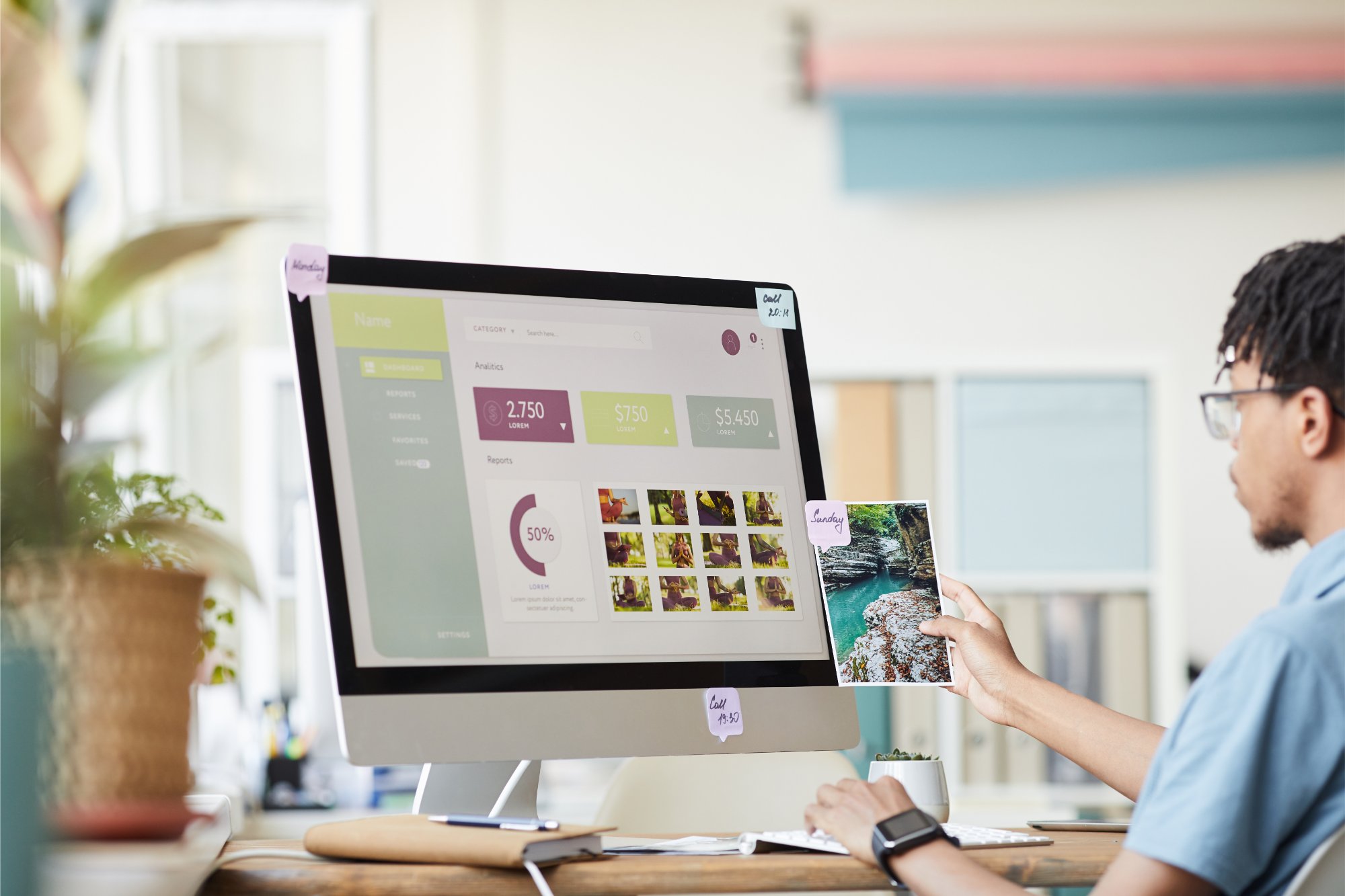
Here are a few basics: clear buttons (call, WhatsApp if relevant, route planner, book a test drive), short forms, optimised photos, key information visible without scrolling (price, mileage, energy, availability, location), and proof of trust (reviews, labels, guarantees). To find out more, read the internal article mobile optimisation thanks to AI suggests ways of improving the experience and reducing abandonment.
Vehicle files: the most profitable page
Whether you're selling new or used, the vehicle specification sheet is often the decisive step. It has to answer four immediate questions: Is this the right model for me? is it within my budget? is it available? can I trust it?.
Recommended structure: a header with quality photos, price and monthly payment (if you offer it), availability, location and visible CTA. Then a strengths block (5 maximum), a standardised features block, a history/condition block for the used car (inspection, maintenance, transparent defects), and a services block (trade-in, financing, delivery, warranty). Transparency reduces objections at the time of the appointment.
Photos and video: convincing without overpromising
Visuals are your number one selling point. The perceived quality of an ad is often correlated with the perceived quality of the dealership. Standardise your shots: identical angles, constant background, controlled lighting, full interior shots, and focus on differentiating options. When it comes to the used car, don't erase any imperfections: trust comes from an honest and consistent approach.
Short videos (30-60 seconds) can increase engagement if they are structured: exterior tour, boot opening, rear seat, dashboard, start-up, and reminder of key assets. The design here is the scenario, not the effects.
Hotel Web Design is the 100% web agency dedicated to the hotel industry, supporting you in all aspects of digital communication: booking websites, natural search engine optimisation specialising in the hotel industry, Google Ads and Google Hotel Ads, social networking campaigns, graphic charters and logos.
Make an appointment today for free advice on optimal digital management.
Designing for conversion: calls to action and reassurance
Visitors must always know what to do next: call, book a test drive, get a trade-in estimate, request a quote, check availability. Each action must be explicit, repeated in the right places, and associated with a realistic promise (response time, times, documents required).
Add elements of reassurance close to the actions: response within 1 hour, no obligation, test drive by appointment, trade-in possible, warranty included, vehicle inspected. The design consists of placing this information at the moment when the doubt arises, not afterwards.
AI and automation: strengthening coherence, not dehumanisation
AI can help to maintain consistent quality: photo cropping, layout suggestions, text variants, prioritisation of leads, or analysis of site navigation. But the objective remains human: to provide better information, respond better, faster, with a stable tone.
For a more technical overview of AI approaches to design, the internal resource neural networks and deep learning explains the logic that can feed optimisation tools (without you needing to do AI yourself).
Operational design: streamlining internal organisation
We often forget that design also serves the team. Poorly thought-out spaces create micro-losses: documents that can't be found, unnecessary trips back and forth, noise, lack of confidentiality, blocked vehicles, tests that are difficult to organise. Good operational design reduces the mental workload and improves service quality.
Concrete examples: a single reception point with quick sorting (sales, after-sales service, parts), an area dedicated to delivery (handling, accessories, paperwork), a collection area with neutral lighting and a visible checklist, and secure but accessible document storage. When the back office runs smoothly, the front office naturally looks professional.

Specificities of used cars vs. new cars: two approaches, one framework
New vehicles (VN) are often based on the brand universe, test drives, configuration and financing. Design should highlight finishes, options and projection (configurator screens, samples, discovery zones).
Used cars are more about transparency, condition, history and value for money. Here, the design must make different vehicles comparable: standardised display, proof of inspection, information on origin, and a clear explanation of the warranty. For used-vehicle entrepreneurs, the external article tips for starting a used car dealership provides a useful framework to link to your choices of organisation and presentation.
Designing with business constraints in mind
A dealership is not an abstract concept store: there are standards, procedures, margins, targets and stock realities. Your design choices need to take account of operations: maintenance, vehicle flow, safety, insurance, seasonality, and the team's real ability to deliver what it promises.
To put these constraints into perspective, the external article how car dealerships work helps you understand the mechanics (sales, after-sales, trade-in, financing) that directly influence your design decisions.
Setting up or taking over a dealership: design in the business plan
If you're opening a new business or taking over an existing one, design needs to be budgeted for as an investment, not as an end-of-project expense. It has an impact on traffic, conversion rates and satisfaction, and therefore on profitability. Define early on: your positioning (price vs. service vs. specialisation), your catchment area, your target volumes, and your differentiating services. Then translate them into spaces and routes.
To structure the stages of a launch project, the external article take over or open a dealership in 5 steps can be used as a checklist, particularly for aligning premises, processes and offering.
Showroom and workshop: two experiences, one brand
After-sales service is another key factor in a dealership: it's where loyalty is built up and reputations secured. If the workshop looks disorganised or dirty, the trust gained in the showroom will crumble. The design must link the two: clear workshop reception, simple explanations, transparency on lead times, appropriate waiting area, and consistent communication (same visual codes, same tone).
In some cases, your structure looks more like a garage (or includes a large garage). To outline the stages and obligations, the external article opening a garage: complete guide provides a reminder of the concrete points that influence layout, signage and reception.
Your quote in 5 minutes
Measuring and improving: design as a continuous cycle
Effective design can be controlled. Choose a few simple indicators: appointment booking rate, trial rate, conversion rate, average response time, post-visit satisfaction, online reviews and after-sales return rate. Then link these figures to concrete elements: legibility of offers, quality of photos, ease of contact, signage, or comfort of spaces.
Proceed by iterations: change one variable at a time (for example the structure of the VO forms, or the reception signage), observe for 2 to 4 weeks, then standardise what works. A small, well-placed adjustment (a better form, a clearer recovery area, a quieter office) can produce significant gains.
Common mistakes to avoid
First mistake: confusing good looks with efficiency. An effective design is legible, coherent and action-oriented. Second mistake: overloading the site with information and promotions, to the point of creating mistrust. Third mistake: neglecting mobile and site speed. Fourth mistake: not standardising (each salesperson prepares their own documents, each vehicle sheet has a different format). Fifth mistake: promising more than the team can deliver, which destroys trust.
Taking action: a simple 10-day plan
Day 1-2: map your customer journey (arrival, welcome, discovery, trial, offer, signature, delivery, after-sales service) and note any friction. Day 3-4: standardise the hierarchy of information (price, proof, benefits, actions). Day 5: harmonise typography and file templates. Day 6: Improve the contact page and appointment booking. Day 7: rework the reception signage. Day 8: Optimise 10 top-traffic vehicle files. Day 9: Train the team in the new structure. Day 10: Measure and adjust.
If you want a quick overview (objectives, priorities, deliverables, budget), you can ask for an estimate in just a few minutes to identify the improvements that will have the most direct impact on your leads and conversion.
Conclusion: design as a competitive advantage
The foundations of design for car dealerships are based on one idea: to reduce uncertainty and increase confidence, at every stage. A legible space, a coherent identity, standardised media, an impeccable mobile and visible proof transform the experience into a lasting sales lever. In a comparative and tense market, the difference is often less about the model than about the clarity of the journey.

 Hotel Web Design is a Google partner with the Google Hotelsincluding our customers benefit on a daily basisGoogle search: information about your accommodation, availability and prices is sent continuously to the search engine, which displays free booking links from the Google search directly to your booking page. These free links represent around 15% of additional commission-free bookings for our customers in 2022! Read our article on free booking links from Google
Booking / reservation website
-
Booking services for hotels and holiday rentals
- Turnkey site with administration interface training on delivery
- Adapted logo and graphic charter. Possibility of using your existing elements
- Hospitality SEO
- Integration of reservations module
- or integration of an external booking engine (Reservit, Availpro, Mister booking, Roomcloud, etc)
- Integration of specific HTML elements (review portals, customer reviews, weather, press, pop-ups, direct chat, etc.)
- Secure SSL / HTTPS
- Multilingual
- Website user interface
- Hosting and domain name
- Fast delivery
![]()
Hotel Web Design is the web agency 100% dedicated to the hotel industryWe can help you with all aspects of digital communication for your accommodation: booking websites, natural referencing specialising in the hotel industry, Google Ads referencing and Google Hotel Ads, social networking campaigns, graphic charters and logos for hotels.
Make an appointment today for free advice on how to optimise the digital management of your accommodation.


