Examples of websites for resorts
Finding the creative spark
When you set out to design a website dedicated to a resort, nothing is more paralysing than the blank page. To avoid inspiration running dry, our studio has developed a series of showcase articles in which we review the best examples on the market, segment by segment. Having specialised in the hotel and restaurant sector for over a decade, we've seen trends come and go, fashions intersect and, above all, travellers' expectations grow in sophistication. Over time, one thing has become clear: as soon as a hotel offers more than just rooms and room service, its website needs to become a genuine digital concierge.
We have therefore selected the platforms that we believe best illustrate this transformation. Some are our own creations, while others come from talented teams that we admire. They all have one thing in common: they transform browsing into a promise of a stay. Visitors don't just 'look' at a site; they already begin their journey.
In the following lines, you will discover a commented selection of five of the most successful sites currently available. Why these? Because they combine aesthetics, commercial performance and storytelling, three pillars without which no digital project can take off. However, we must never forget that a website is above all a reflection of a real place: each pixel must evoke the atmosphere, the rhythm and the promises of your resort. After reading this, I invite you to take a look at our "Creating a website for a hotel resort" dossier to find out more about the technical aspects. You'll find a detailed breakdown of our booking solutions, payment gateways and SEO best practices.
Resort or holiday village? - Let's clarify the terms
The word resort has become a catch-all term, often used in place of "holiday village". However, behind these names lie different realities. The classic hotel is content to offer comfortable accommodation and a small range of related services. A resort, on the other hand, functions like a small independent town: accommodation, restaurants, wellness areas, entertainment and sometimes even shops - everything is designed to ensure that guests lack for nothing from the moment they set down their suitcases until the moment they leave.
This operational complexity implies digital complexity. The site has to manage the booking of a room, of course, but also of a massage, a surfing lesson or a table on the terrace. It has to be inspiring, yet easy to read; it has to provide detailed information without drowning visitors in a deluge of text. Finally, it must unite a community: families, couples, business travellers on seminars - everyone should feel welcome.
For holidaymakers, the advantage is clear: maximum relaxation, zero logistics. Activities are included or easily bookable, the day's programme can be decided at whim, and the meaning of the word "leisure" is all but forgotten. transport. A good resort site crystallises this promise: "Come as you are, everything is already ready.
The particularity and uniqueness of each resort calls for an entirely personalised site. No generic model: your cliff-top spa, your organic vegetable garden, your children's club or your eighteen-hole golf course deserve better than a simple standardised page. From now on, it's all about examples, sources of best practice and ideas for adaptation.
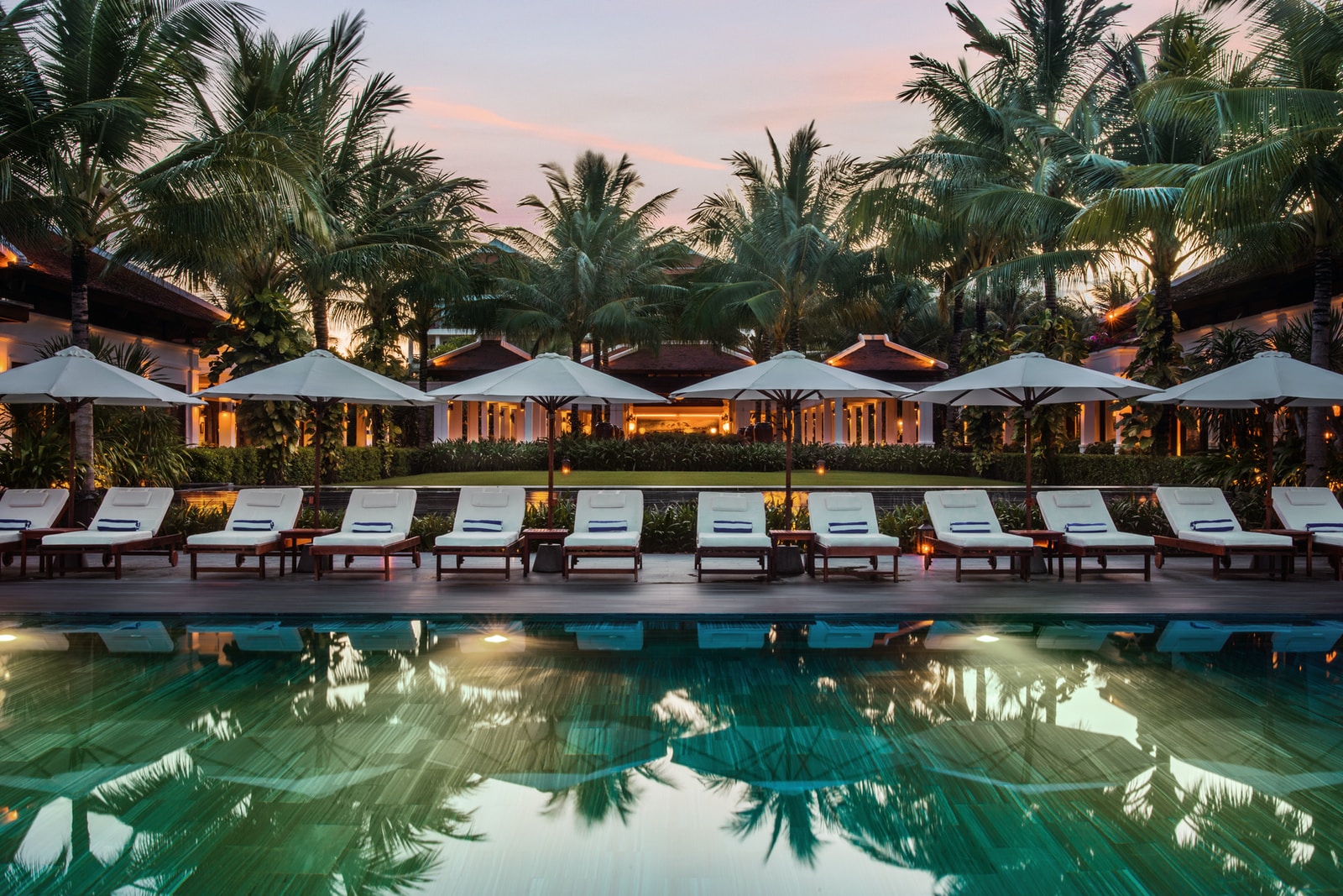
Subtle animation, maximum impact A teaser text that unfolds letter by letter, synchronised with fade-in drone footage of the estuary. No gratuitous effects: each transition tells the story of how the sea meets the forest of the Vendée.
Fresh colour palette Atlantic blue with touches of maritime pine green. The visual consistency is reinforced by personalised icons reminiscent of oyster huts.
Educational "Things to see and do" section Dynamic filtering by age group, weather and duration of activity: a must for families in a hurry.
Encapsulated booking engine No intrusive pop-ups; availability is displayed as a superimposed image as soon as the user clicks on Book.
Your editorial Light, knowing, almost whispered; you can feel the salty breeze.
- Sleek design, Occitan elegance Chalk white, fine typography and terracotta-coloured visuals reminiscent of Toulouse bricks. The overall impression is one of space and the gentleness of the south-west.
- Regional focus An interactive map locates markets, museums and wine tours within twenty minutes. Visitors are immediately aware of the cultural richness of the surrounding area.
- Intelligent multilingualism In addition to the classic English, Spanish has also been integrated, as a courtesy to our Iberian neighbours. The language detector automatically suggests the appropriate version, without the need for a full reload.
- Signature Hotel Web Design : Our studio intervened to streamline the conversion tunnel, which now takes less than forty-five seconds, including payment.
- Photographic immersion Full-screen carousel on arrival, shot with a Leica by a local artist. The image takes precedence, and the text fades into the background, giving way to emotion.
- Narrating the rooms Each category has a detailed description, 360° video, interactive map and Spotify music suggestions. Customers can virtually put together their stay even before booking.
- Ubiquitous contact Live chat, Whatsapp Business and the concierge's direct number line up in the footer, ready to catch the slightest hesitation.
- Timeless elegance Refined serif, scroll-triggered micro-animations and a watermark quote from F. Scott Fitzgerald recall the Riviera of the Roaring Twenties.
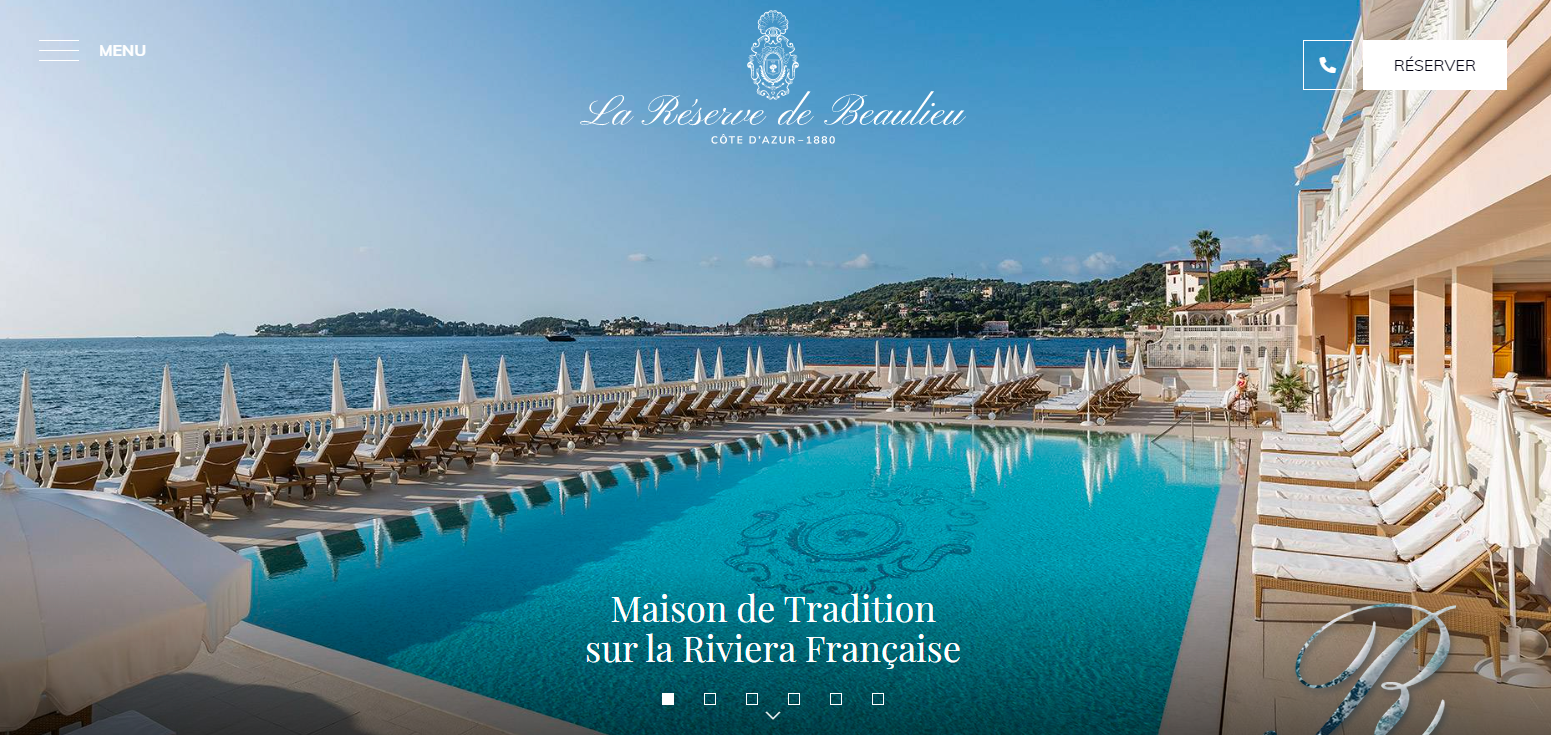
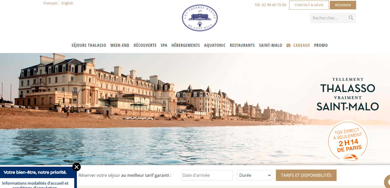
- Sleek graphics, thalasso spirit Minimalist icons, lots of white space, and a slate blue hint of the ramparts of Saint Malo. The visual breath echoes the relaxation experience.
- Explore each universe" menu A tab for each activity - hydrotherapy, yoga by the sea, seaweed tasting - each with an SEO-optimised landing page.
- International accessibility : Certified English version Plain English to maximise clarity, which is essential for Northern European customers.
- Mobile performance Google AMP pages for lightning-fast loading even with a 3G connection, useful for travellers on the move.
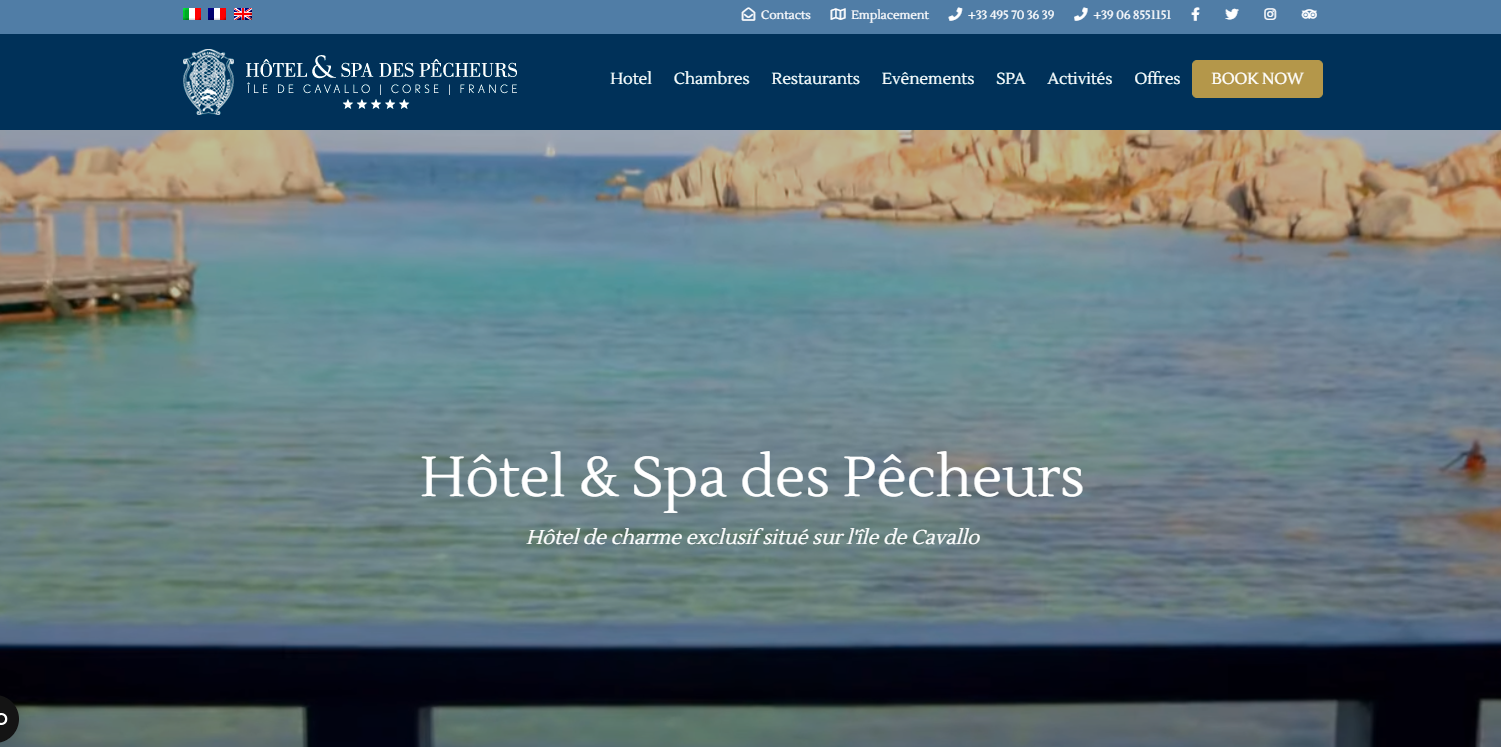
- Hyper-visual interface Full-screen video in the foreground, shot in sequence at dawn, giving you a dizzying view of the white cliffs and turquoise water.
- Surgical SEO Long-tail keywords such as "spa marin Corse du Sud", worked into H2 tags and alternative texts. Result: top position on numerous queries.
- Frictionless booking Interactive calendar synchronised with OTAs in real time, no commission thanks to subtle redirection to direct sales.
- Sense of detail A weekly micro podcast - "The Captain's Notebooks - tells local maritime legends, creating a powerful emotional bond.
Designing your resort's website - Three packages, one made-to-measure promise
Thanks to an agile methodology and modular templates, we can adapt the scope of the project to your ambitions and your budget:
Formula Essential - The showcase site
A few perfectly targeted pages, just enough content to showcase your value proposition. Ideal for a soft launch or a quick refresher.Formula Advance - The pro plus the booking tool
We integrate an engine linked to the main OTAs, with no commission: the margin stays with you, not the intermediary. Statistics on the origin of bookings are fed into a dashboard to refine your campaigns.Formula Prestige - Experience without limits
On the menu: shopping basket for activity packs, online shop (home cosmetics, gift vouchers), connected CRM and marketing automation. Your site then becomes an autonomous profit centre rather than a simple information medium.
In each case, we provide training, ongoing maintenance and editorial support. You're not buying a fixed product; you're hiring a team that's ready to iterate according to the seasons and special actions.
The essentials of a good resort site
Ergonomics and design Mobile first, ultra-intuitive navigation, visible but not garish call-to-action buttons.
Full presentation of accommodation Plans, surface areas, equipment, modular options - everything must be transparent for passengers.
Highlighting activities : Whether it's kite-surfing, a pottery workshop or a wine-tasting session, each activity must have its own place and its own price.
Clear contact information One click to call, one click to send an email, geolocation integrated with GPS.
Fluid booking engine From the home page to payment, no more than three steps.
Customer reviews Verified, authentic, contextualised by date and use (family, couple, business).
Engaging multimedia content HDR photos, drone videos, 3D tours, podcasts - anything to immerse web users.
At the end of the day, a successful site creates a desire: the desire to live the experience, to smell the pine trees, to hear the sound of the waves or the lapping of a palm-fringed pool. Your resort already has this magic; our job is to translate it into digital language.
Our collaboration process - Five steps to a smooth launch
1. Exploration in the field
Before we even open Figma, we visit your estate. There's no substitute for sensory immersion: hearing the cuckoo in the morning, smelling the aroma of freshly baked bread, testing the temperature of the water in the main pool. This phase, often neglected by generalist agencies, feeds the bank of images and expressions that will - quite literally - set the tone for the site.
2. Identity and personas workshop
Around a table, we cross-reference your values, your sales targets and the typical profiles of your customers. Millennial couples, XXL families, digital nomads? Each has its own codes. We then draw up an editorial manifesto that will serve as a compass for every pixel and every word.
3. Interactive prototype
Instead of static mock-ups, we deliver a navigable prototype. You click, you scroll, you test the forms. The feedback is much more precise, which reduces the number of return trips and therefore the time taken to put the site online.
4. API development and integration
Here, the magic happens behind the scenes. PMS connection, payment gateway, channel manager: everything is welded together so that your teams no longer have to juggle between ten interfaces. We document every line of code for easy maintenance and scalability.
5. Launch, monitoring, optimisation
On D-day, we orchestrate the DNS switchover, check that no links break the conversion chain, and then launch an email teasing campaign. The first bookings serve as a barometer; we analyse user behaviour and adjust if necessary. After three months, you receive a detailed report with recommendations for continuous improvement.
This method, refined project by project, guarantees a result in line with your commercial ambitions while preserving the uniqueness of your story. Because, in the end, this site is not ours: it's your digital voice, and we're just the conductors who harmonise the instruments.
In a saturated market, this rigour is the weapon that transforms a simple visitor into an enthusiastic ambassador, ready to share his experience, with photos to back it up, on every social network he frequents. That's how your reputation grows, night after night.
Conclusion - Turn browsing into an invitation
A web project in the tourism sector is not just a shop window; it's a contractual promise. In just a few seconds, the future guest should be able to understand your DNA, imagine what their stay will be like and, ideally, press Book.
By drawing on the best practices detailed above - whether it's an immersive carousel, an integrated booking engine or an audio content strategy - you are laying the foundations for a profitable and sustainable platform. Technology is only as good as the emotion it transmits; commercial performance depends on the confidence visitors feel. At a time when every click can turn into a sale or a bounce, attention to detail makes all the difference.
So, are you ready to write the next success story?


