
The format of old websites
With the rapid and recent changes in the web, and in the way we manage our daily lives more generally, the term Responsive Design came to the fore in the early 2010s.
Responsive design, or "adaptive website", was born with the appearance of the first smartphones and tablets on the connected object market. The first responsive sites were simply "adapted" sites, designed solely to be read on these small-format devices. (m.example.com sites), or via applications downloaded and used directly from these devices. These sites were not scalable and were impractical due to their isolation (they had to be updated separately from sites for desktop computers), so they quickly disappeared from the technological landscape.
Today's responsive sites
Subsequently - for both practical and financial reasons - the security - The need to design fully responsive websites quickly became apparent, especially for restaurant and hotel websites, which are now more than 50% consulted via mobile or tablet devices.
Responsive sites now make it possible to combine all these elements into a single website, which adapts itself to the medium in which it is read.
There are several ways of finding out whether your website is responsive:
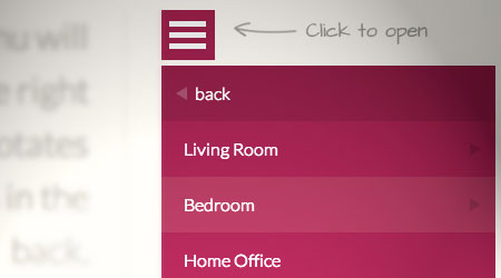
- The simplest and most effective way is to simply resize the browser window on your desktop or laptop. By reducing the window, if your site is responsive, you should see the elements of the page reorganise themselves in an "intelligent" way. The menu bar transformed into a simple three-band icon is a good example.
- The second method is simply to go on a specialised website. Enter your website address and we'll tell you straight away whether it's responsive or not!
Google announced it last year, and it's no longer a surprise: the search engine has set up a mobile-first index which will gradually take precedence over the historical algorithm. The fact that a site is responsive or not will therefore play an increasing role in the evaluation of the natural referencing of each site.
All the websites we design for tourism professionals, hotels, restaurants and local businesses are responsive and secure using HTTPS SSL protocol.

some web sites are still not responsive as at 25.06.18
Source Akamai
The 50% mark for mobile browsing was passed in 2017.
Source: Sweor.com


