

guests book elsewhere even after spending several minutes on your site, comparing your rooms, looking at your photos, and sometimes even starting a booking. This scenario has become so common that it can no longer be explained by mere traveller "disloyalty." It mainly reflects a mechanism: the guest uses your site as an information source and the OTA (Booking, Expedia, etc.) as the transaction tool, because they perceive less risk, more convenience, or a better deal there. Understanding this switch means identifying the invisible friction points that lose the sale at the last moment.
They compare on your site to feel reassured… then buy where the effort seems lowest
In the guest's mind, comparison is not only about finding the lowest price. It serves to reduce uncertainty: Is the location good? Do the rooms look like the photos? Can I cancel easily? Will I be charged straight away? Your site is often excellent at conveying the experience and giving an authentic preview. However, at payment time the OTA appears as a familiar, validated route, with universal signposts (reviews, terms, interface, customer service).
Result: you win the attention battle (the guest reads, explores, shows interest), but you lose the conversion battle (the guest acts elsewhere), because the final action is associated with a platform that minimises effort and maximises the feeling of security.
Price disparity is not always the cause… but it triggers doubt
Even a small gap between your site and an OTA is not read as a mere price difference. It is read as a risk signal: Why is it cheaper there? Will I have the same conditions? And if the OTA displays Best price or Mobile offer, the fear of missing out becomes stronger than the desire to book direct.
Even when your price is the same, the comparison can still be unfavourable if the OTA presents the offer better (breakfast clarified, taxes included, cancellation visible, constant reassurance). The guest does not compare just an amount: they compare a promise, clarity and simplicity.
For a deeper look at concrete levers for hoteliers, the external article 4 winning strategies to fight price disparities illustrates how to take back control without just lowering rates.
Your site informs, the OTA guarantees: the psychology of safety wins
An OTA sells as much a room as a feeling: if something goes wrong, I will be protected. This impression comes from repetitive elements: standardised cancellation policies, instant confirmations, a customer account, centralised customer service, and above all a usage history (I’ve already done this ten times).
By contrast, a hotel website can unintentionally generate micro-worries: a booking engine that looks dated, a payment page that redirects without explanation, a lack of clarity about the charge, or terms written in small, hard-to-interpret text. None of these are dramatic on their own. But the accumulation of such details is enough to tip the decision towards a more familiar environment.

Hotel Web Design is a Google partner with Google Hotels :
your availabilities and prices are continuously sent to Google, which displays free booking links to your booking page.
These links can represent around 10% to 15% additional commission-free bookings. Read the article on
Google's free booking links
.
Conversion frictions: where you lose bookings that were about to be signed
Customers who compare then go book elsewhere are often hot leads. They don’t leave your site because they don’t want your hotel. They leave because the last mile (booking) costs them too much mental effort.
Booking engine: too many steps, too many questions, not enough guidance
When the engine demands too much information too early, or multiplies screens (room choice → options → contact details → payment → verification), each step is an opportunity to doubt. The best interfaces reduce effort: they simplify, explain, reassure, and allow easy correction without penalising the user.
Lack of transparency about the final price
The customer wants to know immediately: whether taxes are included or not, whether breakfast is included, any possible fees, and conditions depending on the period. If the final price appears late, or if elements seem to be added at the end, the user can feel trapped and leave for somewhere that seems clearer.
Payment and security: the moment when trust is at stake
A slow payment page, an unexplained redirection, an interface that doesn’t match the rest of the site, or an ambiguous error message (transaction declined) is enough to break trust. Many users, instead of trying again, will simply type the hotel’s name into an OTA and complete the booking in 30 seconds.
Design can hand the sale to Booking without you noticing.
The paradox: you can have an attractive site, with beautiful photos, and still unconsciously steer the user towards the OTA. This happens when action buttons are poorly prioritised, when essential information is scattered, when key pages don’t answer questions at the right time, or when the mobile experience could be improved.
Some details are pernicious: a barely visible CTA, a menu that hides offers, a search engine hard to use on a smartphone, missing reassurance elements (cancellation, hours, contact, precise location), or a flow that gives the impression that booking direct is more complicated.
To identify the most common traps, you can consult the design mistakes that favour Booking over your site.
OTAs excel at staging scarcity and urgency (and your site rarely does)
Platforms have industrialised behavioural biases: only 1 room left, 12 people are viewing, high demand, free cancellation. Whether one likes these mechanisms or not, they work because they reduce hesitation and give an immediate justification to buy.
On a hotel site, urgency is often absent or too timid. The customer may then think: I’ll come back later, and later… they book elsewhere. Without resorting to artificial pressure, there are legitimate ways to materialise availability, clarify direct benefits, and prevent the user from postponing their decision until tomorrow.
Mobile: comparison happens on a smartphone, but conversion often fails at the same point
Many journeys start on mobile (metro, sofa, terrace), even if the final booking may be made on a computer. Problem: if the mobile experience is painful, the user learns one thing: this site is annoying. And when they want to finalise, they will choose the smoothest route… often the OTA.
Critical points on mobile: loading speed, clarity of prices, simple calendar, short forms, buttons large enough, optimised payment (cards, wallets), and quick access to vital information (parking, late arrival, pets, cot, accessibility). If the user has to search, zoom, endlessly scroll, they get tired and take the easiest option.
Direct offer: if it isn’t obvious, it doesn’t exist
Many hoteliers think they offer direct-booking benefits… but the guest doesn’t see them, or doesn’t understand them. A generic best-price guarantee is no longer enough. The traveller wants proof, clarity and a tangible quid pro quo.
Examples of perceived benefits (provided they are explicit, coherent and easy to obtain): more flexible conditions, upgrade subject to availability, breakfast at a preferential rate, late check-out, welcome drink, or a packaged offer more readable than the OTA. The important thing is not to give a lot, but to make the trade-off simple: booking direct should naturally seem the smarter choice.
The commission war: it’s not just a financial issue, it’s a matter of control
When a guest books via an OTA after comparing on your site, you lose a commission, but you also lose part of the relationship: less data, less ability to personalise, less commercial leeway. It’s not simply a cost line: it’s a dependency that persists when your site does not convert at the expected level.
There are structured actions (no miracles) to reduce this dependency: improve direct conversion rate, strengthen visibility of benefits, work on price/conditions coherence, optimise campaigns, and make the site the centre of gravity. On this subject, how a web agency can reduce your commissions without miracles details a realistic, results‑oriented approach.

Hotel Web Design is the 100% web agency dedicated to the hotel industry, supporting you in all aspects of digital communication: booking websites, natural search engine optimisation specialising in the hotel industry, Google Ads and Google Hotel Ads, social networking campaigns, graphic charters and logos.
Make an appointment today for free advice on optimal digital management.
The site is not a brochure: it is your margin tool
A website that converts is not just pretty. It is a mechanism that protects your profitability: it reduces leakage, recaptures demand, and makes direct booking feel more natural. It must marry three things without contradiction: inspiration (desire), information (proof) and transaction (simplicity).
When these three dimensions are aligned, you stop being a mere waypoint in comparison. You become the place where people decide and book. And this shift has a direct impact on your ability to invest, recruit, renovate and maintain a high level of service.
To understand this profitability logic, how a website can protect your margin highlights the concrete links between digital experience and economic performance.
A wider problem: platforms, asymmetry of power and consumption habits
If customers compare with you then buy elsewhere, it is not only because your site has flaws. It is also because the platform economy has shaped automatisms: centralising, standardising, securing the purchase, and making everything else more costly in effort. Consumers have been trained to delegate part of their decision to interfaces and review systems, sometimes at the expense of direct relationships.
This dynamic is examined from a more societal angle in the external article The new domestics: how the new digital economy pits consumers against employees. Without mechanically transposing to the hotel sector, it helps to understand why platforms become the reflex, and why reclaiming bookings requires real work on trust and experience.
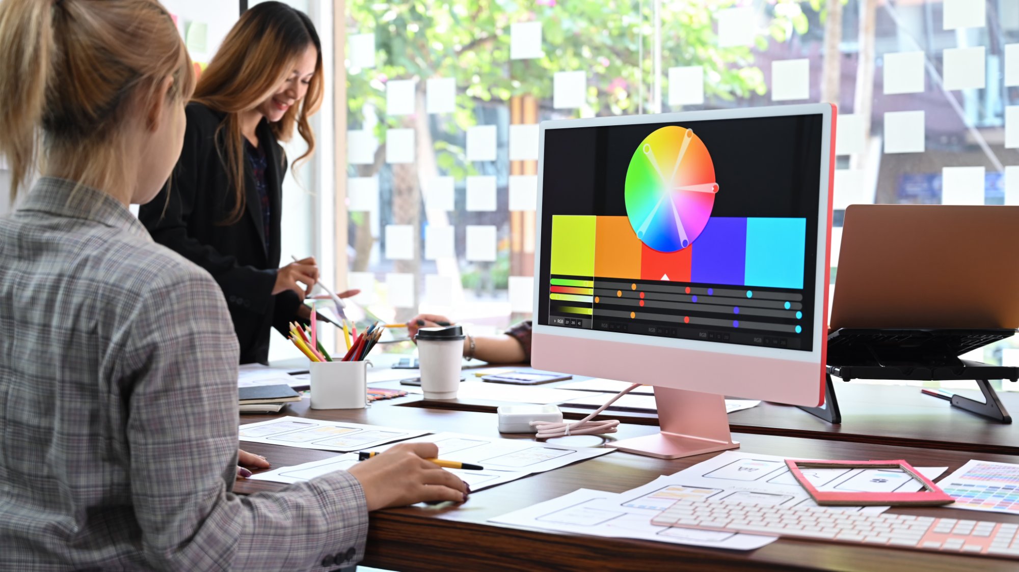
The hotel website must become the centrepiece of your digital strategy again
As long as your site remains peripheral (a shop window), the OTA remains the natural place for conversion. Conversely, when your site becomes the central tool, everything else falls into line: SEO, campaigns, social media, email, content, loyalty. The guest arrives, understands, can picture their stay, and books without wondering whether a safer alternative exists.
To structure this approach, Hotel website: the central tool of your digital strategy presents an overall vision where the site is no longer a passive medium, but a growth engine.
What hoteliers who recover direct bookings do
They don’t fight OTAs hoping guests will change their behaviour on principle. They change the equation: booking direct becomes clearer, simpler, more reassuring and more rewarding. Concretely, they:
1) Clarify the offer: understandable room types, coherent photos, visible benefits, readable conditions.
2) Optimise conversion: fast engine, short journey, transparent final price, smooth payment, impeccable mobile experience.
3) Strengthen reassurance: reviews highlighted (even external ones, if integrated cleanly), policies explained, contact accessible, social proof and accreditations.
4) Work on price parity: the same price under equivalent conditions, or a direct, explicit and verifiable advantage.
5) Measure and iterate: analytics, heatmaps, A/B tests, churn tracking, continuous improvement.
This philosophy is well summed up in Why hoteliers who succeed invest in their website, with the central idea that a good website is not a marketing expense, but a commercial infrastructure.
Turn comparison into booking: a pragmatic action plan
If you want to reduce the share of customers who compare then complete elsewhere, avoid large vague projects. Instead look for net gains where the decision flips.
Step 1: audit the 3 critical pages (room/offers page, search/calendar page, payment/confirmation page). Ask yourself: What might scare people off? What takes too much effort? What’s missing to decide now?.
Step 2: make the benefit impossible to miss. Not by hiding it in the footer or an FAQ. It must be present at the right moment: at the pricing stage, at the rate selection, and just before payment.
Your quote in 5 minutes
Step 3: align promise and proof. If you promise flexibility, show it (simple terms). If you promise the best price, explain what that means (same conditions, taxes included, etc.).
Step 4: fix mobile irritants. Often, 20–30 well-targeted fixes do more than 80–90 of an aesthetic redesign.
Step 5: track drop-offs. Where do users leave? On which screen? On which device? From which source (SEO, Ads, social)? Without this data, you improve by intuition, and intuition is often wrong.
If you want to quickly identify your leaks, get support
When customers leave your site at the last moment, the problem is rarely single: it’s a stack of details (offer, design, engine, reassurance, mobile, consistency). An external view often spots in minutes what hands the booking to the OTA.
To discuss it and get a conversion-focused diagnosis, you can request Your quote in 5 minutes.













Hotel Web Design is a Google partner with the Google Hotelsincluding our customers benefit on a daily basisGoogle search: information about your accommodation, availability and prices is sent continuously to the search engine, which displays free booking links from the Google search directly to your booking page. These free links represent around 15% of additional commission-free bookings for our customers in 2022! Read our article on free booking links from Google
Booking / reservation website
-
Booking services for hotels and holiday rentals
- Turnkey site with administration interface training on delivery
- Adapted logo and graphic charter. Possibility of using your existing elements
- Hospitality SEO
- Integration of reservations module
- or integration of an external booking engine (Reservit, Availpro, Mister booking, Roomcloud, etc)
- Integration of specific HTML elements (review portals, customer reviews, weather, press, pop-ups, direct chat, etc.)
- Secure SSL / HTTPS
- Multilingual
- Website user interface
- Hosting and domain name
- Fast delivery

Hotel Web Design is the web agency 100% dedicated to the hotel industryWe can help you with all aspects of digital communication for your accommodation: booking websites, natural referencing specialising in the hotel industry, Google Ads referencing and Google Hotel Ads, social networking campaigns, graphic charters and logos for hotels.
Make an appointment today for free advice on how to optimise the digital management of your accommodation.