

direct booking user experience
Direct booking is decided before price: during the journey
We often attribute the growth (or stagnation) of direct sales to pricing, Google visibility or promotions. In reality, a large part of the decision crystallises much earlier, in the first few seconds of browsing. A visitor who arrives on your site is not yet a customer: they are comparing, doubting, sometimes stressed (dates, budget, cancellations, timings). It is precisely there that everything is decided.
Direct booking therefore begins well before the booking engine. It starts the moment the user thinks: I feel understood, I can find things easily, I can book without risk. If that feeling doesn’t exist, the easiest route becomes the platform. And it’s not a question of loyalty: it’s a question of comfort.
Some resources explain this lever in detail: User experience: the key to boosting your bookings. The idea is not to make things look pretty, but to reduce the frictions that push a prospect towards Booking or Airbnb.
Direct, the user pays an invisible tax: time, effort, uncertainty. One extra second to load, information that is hard to find, a form that asks too much, and your site becomes mentally more costly than an OTA. Yet on an OTA everything is optimised to convert: filters, reviews, immediate availability, standardised steps, omnipresent reassurance.']}]}]}{
}{.

The question to ask is not just "Does my site allow booking?", but "Does my site allow booking without thinking?". Because the user does not compare prices only: they compare experiences. And if they have to work to book, they abandon.
This logic ties into a simple principle: conversion is not an event, it is the consequence of a seamless journey.
You don’t need to convince: you must reassure
In hospitality, direct booking is often treated as a sales pitch: best price guaranteed, exclusive offers, free breakfast. These elements help, but they only act after a crucial step: trust. The user needs to picture themselves, understand the terms, see the room, check the location, and confirm the flexibility.
Trust is not a badge: it is a set of coherent micro-signals. A page that loads quickly, clear photos, readable typography, visible CTAs, an accessible cancellation policy, reviews presented intelligently, an engine that does not surprise with late fees. In other words: an experience without unpleasant surprises.
On the subject, this page nicely illustrates the customer-side benefits: Why book a hotel directly. The key point to remember: perceived benefit only exists if the journey makes it easy to achieve.
What the user really wants to do on your site (and how to help them)
A visitor does not arrive to browse. They arrive to accomplish a task. The most common intentions are simple:

Hotel Web Design is a Google partner with Google Hotels :
your availabilities and prices are continuously sent to Google, which displays free booking links to your booking page.
These links can represent around 10% to 15% additional commission-free bookings. Read the article on
Google's free booking links
.
1) Check prices and availability for the chosen dates. 2) Understand the location and access. 3) Compare room categories. 4) Confirm terms (cancellation, payment, times). 5) Reassure via social proof (reviews, photos, labels). 6) Complete quickly.
Your UX should therefore be decision support. This requires a clear information hierarchy: what helps booking must be visible immediately; what is secondary should remain accessible without cluttering.
If you must remember one rule: the more the user hesitates, the more they go away to compare elsewhere.
UX: the invisible decisions that make the difference
Experience is not just design. It is built through concrete choices: wording, sequences, feedback, consistency. To frame the topic, a useful practical definition is available here: What is user experience (UX)?.
In a hotel context, these invisible decisions translate as:
– Clear and constant calls to action (Check availability, Choose these dates).
– Pages that answer questions before they are asked.
– Seamless continuity between the site and the engine (same visual codes, same tone, same promises).
– A mobile journey designed for the thumb (short forms, adapted fields, usable calendar).
These are details, but they are what make a user finally book… or go back to another platform for reassurance.
Mobile is not a channel: it is the channel
A large part of searches are done on smartphones, sometimes in situations of fragmented attention: commuting, on a break, on the sofa, during a conversation. The user will not tolerate labyrinthine menus, intrusive pop-ups, unreadable PDFs, or pages that are too heavy.
If your site loads slowly, if photos are poorly framed, if the engine calendar is cumbersome, you lose. Not a little: you lose systematically, because the competition is one gesture away.
Optimising for mobile is not simply being responsive. It is designing a journey where one can book with a single hand, without zooming, without searching.
The booking engine: where the UX must be most rigorous
Many establishments invest in a beautiful website, then add a booking engine as a separate module. It is often there that conversion collapses: visual break, too many steps, unnecessary fields, poor translation, lack of reassurance, fees appearing late, unexplained errors.
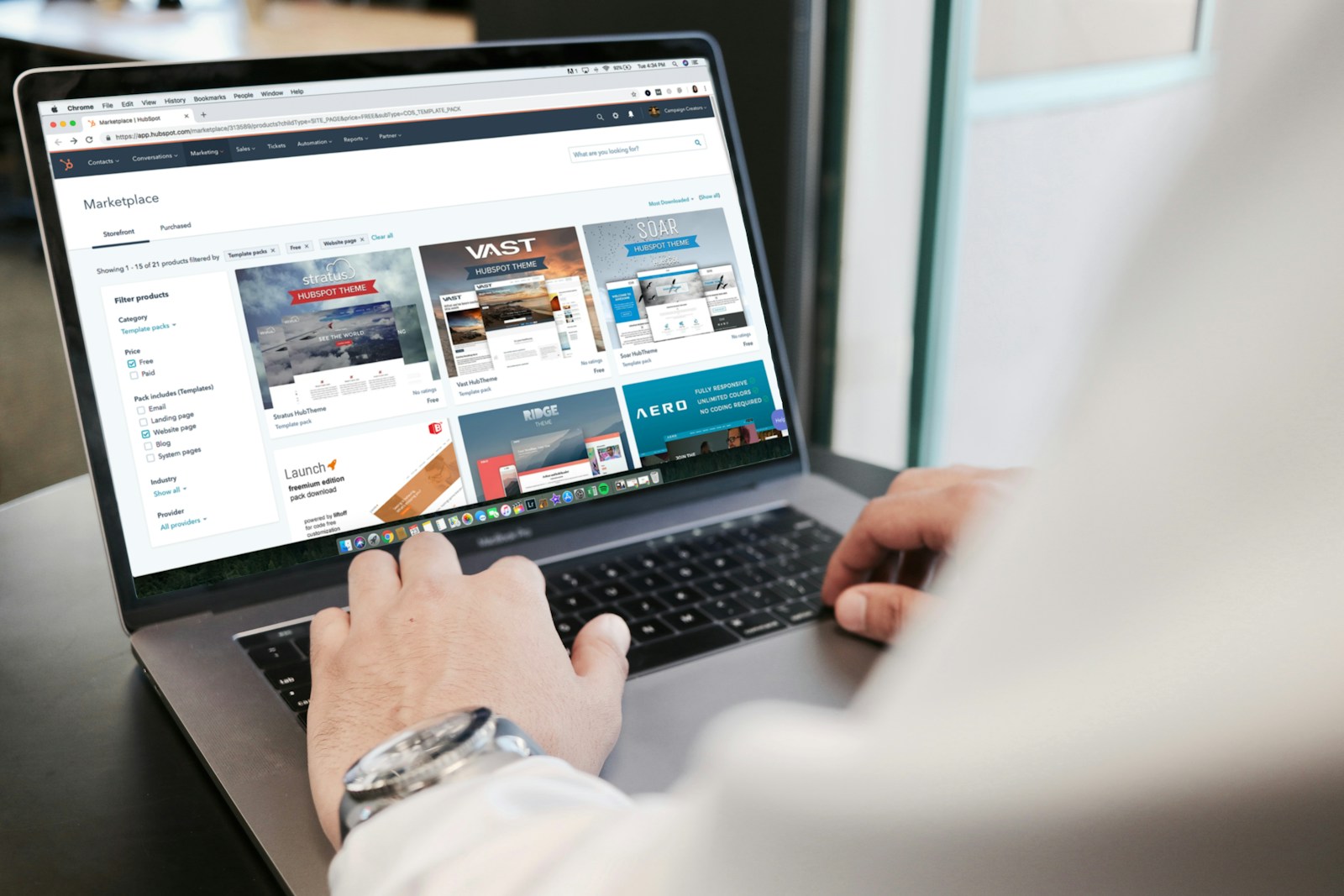
The engine should be seen as a natural extension of the site, not as an external page. It should:
– Clearly display the total and what it includes.
– Highlight policies (cancellation, prepayment) at the right moment.
– Reduce the number of clicks to reach payment.
– Offer understandable options (breakfast, parking) without overloading.
– Avoid mandatory accounts and technical friction.
It’s often here that generic solutions show their limits, as they are designed to work everywhere rather than to convert on your site. On this point, see: Why platforms' turnkey solutions are not enough.
Social proof should aid the decision, not make noise
Reviews, ratings, testimonials, articles, social media: all of this reassures, provided it is presented usefully. Too often reviews are either absent, displayed without context, or placed in a corner with no impact. Conversely, some sites flood the page with widgets and badges, which harms readability.
The right balance: highlight a few strong, recent pieces of proof that are consistent with your positioning (quiet, gourmet, family-friendly, business…), then allow the user to access the details if they wish. The aim is not to prove you exist, but to reduce uncertainty when they are about to pay.
To explore further the link between satisfaction and journey design, you can consult: User Experience: How to Ensure Satisfaction ….
Direct booking is also a relationship strategy (and UX is its foundation)
A point often underestimated: the user experience does not end at the Confirm click. It determines your ability to build a lasting relationship. A guest who books directly and experiences a simple journey is more likely to return direct. A guest who struggled, even if they booked, will remember the effort.
The website then becomes a loyalty tool: clear information space, comprehensible benefits, coherent offers, smooth post-booking communication. This is the angle developed here: Website and loyalty: the weapon against Booking.
In other words: good UX does not only optimise immediate conversion, it reduces long-term dependency.
OTAs: a usage standard… and a reminder of what the user expects
Rather than viewing Booking and Airbnb only as rivals, it is useful to consider them as habit-makers. They have trained users to certain standards: transparency, speed, instant confirmation, clear cancellation, solid mobile UX, clear emails.

Hotel Web Design is the 100% web agency dedicated to the hotel industry, supporting you in all aspects of digital communication: booking websites, natural search engine optimisation specialising in the hotel industry, Google Ads and Google Hotel Ads, social networking campaigns, graphic charters and logos.
Make an appointment today for free advice on optimal digital management.
Your direct booking must reach a comparable level on the fundamentals, while adding what OTAs cannot offer as well: the human connection, the uniqueness of the property, local advice, genuinely exclusive benefits, personalised communication.
To set the strategic framework, this article is relevant: Booking and Airbnb: partners or competitors of your hotel.
Customer data: an invisible benefit… that depends on the journey
There is much talk about commissions, but the other major cost of OTAs is the loss of control over the customer relationship. Direct, you can build a qualified base, understand preferences, segment better, welcome better, and follow up better. But this promise holds only if the booking journey collects what is necessary without being intrusive, and if the follow-up is professional (emails, consent, clarity).
The topic is crucial, especially when a platform restricts access to certain information: How to retrieve the customer data that Booking keeps for itself.
The logic is simple: UX is not just the front end, it also shapes the quality of information and the ability to turn a stay into a relationship.
How to prioritise: the 7 UX projects that most impact direct booking
If you have to arbitrate (time, budget, team), here are the projects that generally have the most direct impact on conversion:
1) Speed and stability (Core Web Vitals, optimised images, controlled scripts).
2) Clarity of the offer (comparable rooms, readable benefits, consistent photos).
3) Intention-driven navigation (immediate access to rates, location, terms).
4) Site → booking engine continuity (no breaks, no surprises, fewer steps).
5) Reassurance at the right moment (cancellation, payment, contact, confirmation).
6) True mobile-first (calendar, forms, buttons, legibility).
7) Measurement (own tracking, funnels, A/B testing, analysis of drop-offs).
This plan has one advantage: it prevents you from remaking the site without impact. The aim is not a facelift, but a methodical reduction of leak points.
Why a specialised approach is often more cost-effective than a generic one
Hospitality has specific constraints: seasonality, room types, multiple rates, conditions, packages, multi-language, multi-device, parity issues, PMS/channel manager integrations, OTA pressure. An effective UX must take this business context into account, not just design trends.
This is precisely what is covered by: How a hotel-specialist agency better understands your business challenges.
In practice, the specialised approach is apparent in the ability to link UX decisions to concrete indicators: conversion rate, share of direct bookings, acquisition cost, repeat purchase rate, average basket, and data quality.
Conclusion: direct booking begins when the user feels guided
Direct booking is not a button, nor a marketing promise. It is a complete experience: finding, understanding, projecting, being reassured, paying without friction, receiving a clear confirmation. When this journey is smooth, you do not have to wrestle the sale: the user naturally chooses the simplest path.
If you want to quickly assess your priorities (site + engine + mobile + reassurance), you can start with Your quote in 5 minutes.













Hotel Web Design is a Google partner with the Google Hotelsincluding our customers benefit on a daily basisGoogle search: information about your accommodation, availability and prices is sent continuously to the search engine, which displays free booking links from the Google search directly to your booking page. These free links represent around 15% of additional commission-free bookings for our customers in 2022! Read our article on free booking links from Google
Booking / reservation website
-
Booking services for hotels and holiday rentals
- Turnkey site with administration interface training on delivery
- Adapted logo and graphic charter. Possibility of using your existing elements
- Hospitality SEO
- Integration of reservations module
- or integration of an external booking engine (Reservit, Availpro, Mister booking, Roomcloud, etc)
- Integration of specific HTML elements (review portals, customer reviews, weather, press, pop-ups, direct chat, etc.)
- Secure SSL / HTTPS
- Multilingual
- Website user interface
- Hosting and domain name
- Fast delivery

Hotel Web Design is the web agency 100% dedicated to the hotel industryWe can help you with all aspects of digital communication for your accommodation: booking websites, natural referencing specialising in the hotel industry, Google Ads referencing and Google Hotel Ads, social networking campaigns, graphic charters and logos for hotels.
Make an appointment today for free advice on how to optimise the digital management of your accommodation.